

Device diversity has grown to a point where web developers can’t simply assume that they know which devices visitors are using to access their websites. They need to make sure the experience is great across all devices, including laptops, smartphones, tablets, or even smart TVs. This can be problematic especially in terms of keeping the website fast and lightweight for every visitor.
DeviceAtlas CTO Ronan Cremin recently spoke during the NGiNX conference in San Francisco about the best ways to deliver great performance on a diverse web. Ronan’s presentation shows how device detection in the server environment can dramatically improve performance whilst reducing infrastructure and bandwidth costs by half.
Here are some key concepts from Ronan’s speech.
A new web reality
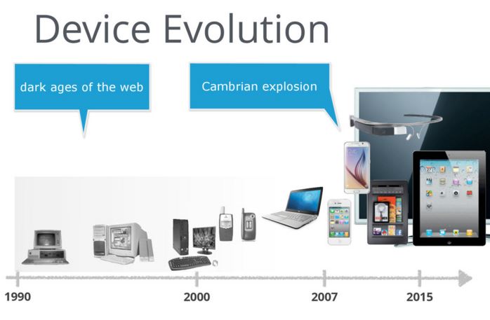
In the past, mobile web and desktop web were two separate worlds, given the limited browsing capabilities of early mobile devices. Mobile web offered much less content, which was browsed in a fundamentally different way.
The situation changed circa 2007 when the original iPhone was released, followed by the first Android devices. The new types of Operating Systems and the proliferation of touchscreens reduced the gap between the mobile and the desktop web. Mobile phones had evolved to the point where you could have an excellent web experience on a mobile device.
This established that Web is important on mobile and opened new doors for businesses to harness their mobile traffic in a variety of ways. Businesses must now understand the key differences between web-enabled devices so that they can address all visitors, and not just those using laptops on good internet connectivity.
Web performance crisis
There are a few ways to build mobile-friendly websites including responsive (RWD), adaptive (AWD), and some hybrid approaches.
RWD is getting the most attention today even though it’s not without its issues. The one-size-fits-all technique is difficult in terms of keeping the website fast and lightweight, and it’s also problematic in terms of addressing many user contexts. RWD has been recently called the “McDonald’s Cheesburger of Mobile SEO” by the marketingland.com.
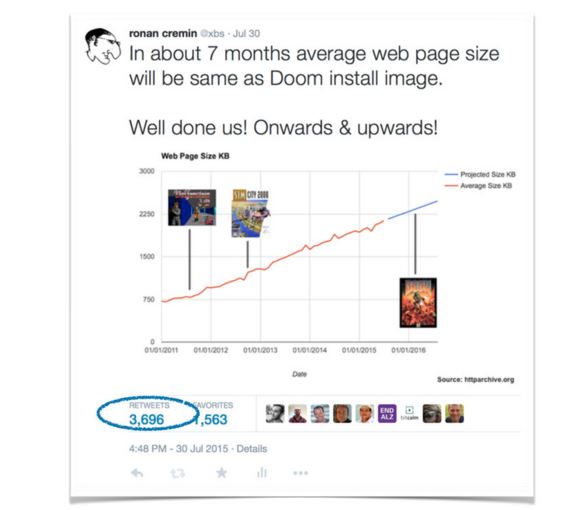
In a recent tweet that was retweeted roughly 4,000 times, Ronan Cremin noticed that the average size of a website will soon surpass the size of the original Doom’s installation file. Sites are typically bloated with content that make them slow on mobile devices including rich JS libraries, non-standard fonts, rich web frameworks, ad trackers, heavy imagery, etc. All these aspects make for an extremely disappointing User Experience on mobile devices.
Solution
One of the solutions to the web performance crisis is server-side website optimisation based on device detection. This approach is also known as Adaptive Delivery or Adaptive Web Design (AWD). As we pointed out in a recent article on the DeviceAtlas blog, AWD is now used by the majority of world’s most visited websites. The adaptive technique not only improves the mobile web experience, but also saves on bandwidth which if beneficial for both, the users and website owners.
Case study
Ronan Cremin presented a case study in which he examined how an NGINX-based web app can be improved by utilising server-side device detection. Here is a brief comparison that allows you to understand what savings are possible by using server-side adaptation.

The case study proved that the optimised, device-aware websites had:
- 65% faster load time
- Savings on data transfer and battery life for mobile users
- Improved conversion rate
- Reduced bounce rate
- No reduction in functionality
Check out all the slides for the Ronan Cremin’s presentation here: