As dotMobi brings DeviceAtlas to the cloud Ronan Cremin, Director of Engineering at dotMobi, charts the increasing complexity of the device landscape for developers in the first of two pieces looking at device fragmentation.
In the beginning the web was a much simpler place. By the time the web was becoming a mainstream media in the late 1990’s there was only one device through which you accessed it: the humble desktop PC, running one of just a handful of browsers.
Mobile phones of the era were just that — portable telephones that could do little except make calls and send text messages. In short, there was no realistic way for mobile devices of the time to access the web. The result of this was that web developers of the time had a very narrow range of diversity to deal with — it was desktop browsers or nothing, and life was easy.
- There are about 6,500 distinct web-capable mobile devices
- Mobile device sales to end users totalled 1.6 billion units in 2010 (Source: Gartner)
- Over 15% of its search traffic is mobile in developed markets (Source:Google)
- Not having a mobile strategy is like closing your site for business one day a week
- Device Detection is an essential part of any online strategy
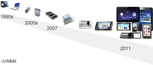
A few years later, in the midst of the dotcom explosion, the first inklings of device evolution were becoming apparent: some phones could now browse a rudimentary version of the web, particularly in more advanced markets such as Japan where devices and networks were far ahead of the rest of the world. At this point in the evolution of the web, however, there was a vast gulf in capabilities between the devices at either end of the spectrum - mobile devices at one end, and PCs at the other. The average web-capable mobile device had a screen area between 50 and 100 times smaller than the average PC, SSL was not possible, Javascript was a distant dream. The device ecosystem was now a duopoly with no middle ground:

This initial split marked the beginning of the Cambrian explosion and the evolutionary advances came thick and fast over the subsequent years.
- In 2007 the iPhone changed everything — the mobile phone had now evolved to the point where you could have an excellent web experience on a mobile device.
- This was soon followed by Android and now, instead of there being a clear distinction between the very low-end experience of a typical mobile phone and desktop PC, things were getting quite a bit greyer.
- In 2008 the new category of netbooks blurred the previously ecological distinct niche carved out by laptops
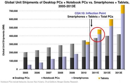
- In 2010 tablets went mainstream and muddied the very concept of a mobile device. In 2011 tablets have evolved to multiple different sizes (5”, 7”, 10”).
- Smartphones will soon represent 50% of the market in some western territories, and smartphones themselves have evolved into multiple sizes and form factors, some with screens as big as 4.7”, with most happy to work in either landscape or portrait mode.
Evolution has filled the previously huge gap between mobile and desktop. This is a fantastic outcome for web users but has resulted in a hugely complex landscape for web developers: the previously clear view of mobile web as a separate entity to desktop web is now quite obviously antediluvian. The world of web devices is now populated with different devices filling every available ecological niche: feature phone-> smartphone -> small tablet -> big tablet -> netbook -> laptop -> desktop. We have evolved from a situation where a single type of web device (the desktop) dominated utterly to a post-Cambrian explosion period with endless diversity to address all needs, and we’re just getting started.

As a web developer in this new reality you need to know more about the devices that you are dealing with. If you want your customer to have the best web experience you can no longer make naive assumptions about the device they're using. To do any less than this is to fail to capture an audience segment. Fast, accurate device data is the compass you need to navigate this new landscape and ensure that you are serving the right content to the right devices.


