

Google has recently upped the ante with its updated stance on redirection of users to mobile content. From now on Google will append a warning if a mobile search result redirects users to the home page of a mobile site rather than presenting a mobile specific version of the content. This change is designed to address poor user experience where a non-intuitive redirection gets between the user and the content they are looking for.
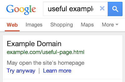
Google Webmaster Central Blog shows that the search results will look something like the image below, which ultimately may impact on site visits.
Google Recommendations
Google makes several recommendations to address what it terms "faulty redirects":
- Configure your server to redirect smartphone users to the equivalent URL on your mobile site.
- If a page on your site doesn’t have a smartphone equivalent, redirect users to the equivalent desktop page rather than the smartphone home page.
- Consider responsive web design, which serves the same content for desktop and smartphone users.
As responsive design may or may not work for your business model, given the issues that have been highlighted here, here and elsewhere, let's concentrate on the redirection-specific aspect of this. If you do use responsive you should consider RESS (REsponsive design with Server Side components) for which purpose DeviceAtlas can easily be used.
Redirection from a desktop site to a mobile site can happen in a number of ways. It can happen on the client, using a client scripting language such as JavaScript, or on the server, scripted at application level in a language such as PHP, or at container level with something like an htaccess or configuration script or module for Apache and Nginx and other servers. And then there are hybrid or cloud based approaches, where a redirect script can be included as JavaScript on the client, that makes a request to a cloud server script to determine what to do with the visitor. But whatever the implementation, the general approach is similar:
- Identify user as mobile or not
- Determine URL to redirect to
- Redirect
Identifying mobile visitors
DeviceAtlas identifies your mobile visitors server-side via user-agent identification. With a successful identification rate of over 99.8% this is an extremely robust, accurate, and fast approach to determine if a visitor is mobile, desktop, tablet or other category.
It's worth noting that it is far superior to JavaScript methods which suffer from extra latency over server side approaches, due to the client-side nature of the redirect and the need to download, parse and execute the JavaScript before the redirection can happen. Regex approaches for their part suffer from accuracy and maintainability issues.
Determine redirect URL
Making sure you have corresponding mobile pages for your desktop pages is the most failsafe way to ensure adequate redirection and user experience.
Once you have identified and/or created corresponding desktop and mobile pages, a redirect mapping can be set up between them. In the simplest case, you would have the same URL path (everything after the domain name) for both your desktop and mobile pages. Then, the redirect URL is easy to build: it's just the mobile domain along with the path of requested desktop page appended.
This is in fact the approach taken with this site, where a URL such as
https://deviceatlas.com/blog/google-redirection-guidelines
is easily translated into
http://deviceatlas.mobi/site/blog/google-redirection-guidelines
If you don't have the luxury of identical URL paths on your desktop and mobile sites, then you'll need some kind of a mapping or look-up table where each desktop URL is mapped to a corresponding mobile URL. When a request is made by a mobile client for a desktop page, a look-up is performed and the user is redirected to the appropriate mobile page.
Redirection
If using a server-side solution, then either an HTTP 301 or 302 redirect should be performed, with Google stating a preference for the 302 option. With htaccess, it would look like this:
RewriteRule ^(.*)$ http://example.mobi [L,R=302]
In PHP it could look like this:
header('Location: ' . $redirect_url);
If using a JavaScript solution, a redirect can be performed using:
window.location.href = "http://example.mobi";
Canonical and alternate links
Once you have the redirection in place, Google also recommends that you put in place canonical links from one page to the other, to indicate to the search engine that they are both versions of the same page, and so that the Google juice won't be split between them which would result in a lower ranking for both.
Canonical links are pretty simple to use. Let's say you decide that you want all your Google juice for a pair of pages (let's use the URL for this article, and its mobile version) to go to the desktop page, then you simply add
<link rel="alternate" media="only screen and (max-width: 640px)" href="http://deviceatlas.mobi/blog/google-redirection-guidelines" />
to the head section of the desktop page, indicating that there's an alternate mobile version, and add
<link rel="canonical" href="http://deviceatlas.com/blog/google-redirection-guidelines" />
to the head section of the mobile page, to indicate that it is an alternative version of the URL specified. That's the gist of it, you can read more about canonical and alternate links here. You can verify implementation on this site if you hit View source now!
Let the user decide
While canonical and alternate links provide a mechanism for search engines to know which is the master version of a page, you should also provide HTML links between the pages to let the user override the redirection if they desire. These links should go both ways, i.e. a mobile client on the mobile site should be able to request the desktop site, and likewise a desktop client on the desktop site should be able to request the mobile version. Cookies can be useful here to ensure that your site remembers the choice of the user, and doesn't keep redirecting to the other version whenever a link is clicked or a new page is requested.
One last consideration
And finally, Google recommends that if there is no corresponding mobile page for a desktop page, then there should be no redirection at all i.e. the user should not be redirected to the mobile site and should instead receive the full desktop page. While this makes sense for high-end devices, where we can be relatively sure that the device will happily render the page, even if it's not optimised for mobile devices, it seems dubious advice where some of the target audience happens to be using low-end devices, and accessing such a page may be more than the device can handle causing it to freeze, crash or implode. Once again, this is about knowing your target audience, and choosing an appropriate solution.
Adapted from original article by Ruadhan O'Donoghue (@rodono) published on mobiForge.
