This is the second article in a series about how the major internet brands deliver their mobile web experience. The previous article is available here: Anatomy of a mobile web experience: google.com
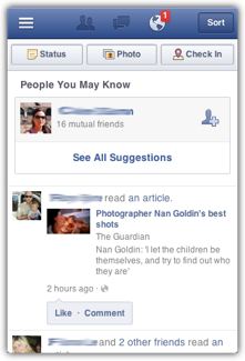
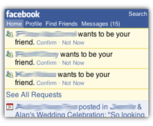
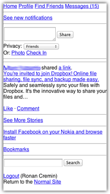
These following screenshots, taken at the approximate resolution of the real device, show how facebook.com looks on a range of popular phones. You can browse the device properties on DeviceAtlas here: iPhone, BlackBerry Curve, Nokia 6300. For convenience I'm using the 320x480 resolution of the first 3 generations of iPhone here, not the 480x960 screen of the iPhone 4 and 4S.
 iPhone
|
 BlackBerry Curve
|
 Nokia 6300
|
The following table shows some of the key differences between the different versions of the Facebook "Home" page served to different devices after logging into facebook.com. I've also included the "Simplified Site" that Facebook links from the lower-end templates.
| iPhone | BlackBerry Curve | Nokia 6300 | Simplified Site | |
| HTML size (Kb) | 31 | 13 | 11 | 3 |
| Images size (Kb) | 17 | 33 | 33 | - |
| JavaScript size (Kb) | 62 | - | - | - |
| CSS size (Kb) | 15 | (inline) | 8 | 8 |
| Total page weight (Kb) | 124 * | 46 | 53 | 11 |
| No. of HTTP requests | 14 | 13 | 16 | 5 |
| GZIP utilized | ✔ | ✔ | ✔ | ✔ |
| Doctype served | XHTML Mobile 1.0 | XHTML Mobile 1.0 | XHTML Mobile 1.0 | HTML Mobile 1.0 |
| JavaScript usage | extensive, 7 functions | - | - | - |
| Data URIs | ✔ | ✗ | ✗ | ✗ |
| CSS usage | extensive | minimal | minimal | minimal |
| Media queries utilized | ✗ | ✗ | ✗ | ✗ |
* On capable devices Facebook use local storage to do some caching, so this figure isn't directly comparable to the others. On my test device the the size of the local storage database was about 50Kb, but this depends quite a bit on what's happening in your Facebook timeline.
Analysis
Again, as with my analysis of Google's mobile web experience, Facebook serves an entirely different HTML document to each device that I emulated. Unlike Google, whose simple-looking home page makes it more viable to present a uniform face across different devices, Facebook's Home page looks quite different in each case, despite keeping much the same content and functionality intact. Facebook adapts both the styling and the content to ensure a reasonable experience on each device.
Where Google appears to fine tune the experience as far as possible on the server side, Facebook uses a more nuanced strategy for their adaptation, utilizing two distinct tiers in their mobile adaptation, each with a different approach.
At the high end, for devices running WebKit-based browsers, FaceBook uses one design that adapts itself to the particular device in question, client-side. This experience is visually rich and uses extensive JavaScript to add functionality such as the familiar slide-in menu on the left and various AJAX niceties. JavaScript is used to calculate usable screen dimensions and analyzes the device's User-Agent string in the process. Interestingly, the usable screen dimension calculations explicitly look for "iPhone", "iPad" and "Android" in the user agent string, but not "iPod". This richer version of the interface also makes extensive use of HTML5 features such as data attributes and adds meta tags to control the viewport and reference the Apple touch icon for bookmarking the site on the desktop.
For other classes of device, Facebook uses server-side device detection to send a packaged experience to each device, with no client-side code required. As with Google, the package of HTML and CSS is quite finely tuned to the device in question, though not without some apparent oversights. Facebook alters the pages in three significant ways depending on the device:
- HTML: Facebook varies the page payload quite significantly depending on the device in question e.g. the user's timeline is far shorter on lesser devices. The complexity of the HTML structure (depth of nested elements) varies widely also, a welcome relief for less powerful devices for which rendering time is a significant component of time taken to view a page.
- Images: Facebook uses server-side resizing to deliver images 180px wide across the board. This is a reasonable compromise—180px is wide enough to be acceptable on most smartphones, but also narrow enough to fit on most feature phones. Using one size image for all devices avoids a lot of custom resizing. On the Simplified Site images are jettisoned entirely, yielding a very lightweight page (apart from the apparently overlooked CSS file, which appears to be unnecessary)
- CSS: Facebook uses entirely different CSS stylesheets for different devices, going from a 980 line behemoth delivered to WebKit devices down to about 130 lines in the case of the BlackBerry. Facebook also changes the method of delivery depending on the device: on most devices CSS is externally linked from the <head> of the document as usual, but for the BlackBerry device I tested inline CSS is used instead. It's not clear why this is—on the one hand, an HTTP request is saved, but inlining the CSS means that the device can't cache the style information, causing some inefficiencies.
Facebook uses essentially no JavaScript at all for most lower end devices, save for a couple of onload() envents. No media queries are used in any version of the mobile web interface.
Helpfully, Facebook offers a link to a "Simplified Site" for users who are experiencing difficulties with the version of the site served by default. This version dispenses with pretty much everything except for plain text elements. This version seems to have taken the place of lite.facebook.com, which is no longer supported.

Overall, as with Google, there is a huge difference in between the pages delivered to the high-end and low end devices. In terms of page weight, the difference is roughly a factor of 10 but the complexity of the pages is greatly altered too, presumably an acknowledgement of the limited CPU resources available on lesser devices. This is a real issue—even the very simplified site takes about 10s to render on a Nokia 6300. Perhaps the best way to visualize the complexity difference is with a 3D rendered view of the DOM (finally a use for this Firefox feature!). Note the vastly more complex layout used for WebKit browsers (the number of layers corresponds to the depth of nesting of HTML elements).
 iPhone
|
 BlackBerry Curve
|
 Nokia 6300
|
Notes
Facebook serve a 450 line, 61Kb CSS (8Kb compressed) to the Nokia 6300 despite the fact that few of the selectors defined in it are utilized anywhere. This imposes a big burden on a device such as the lowly Nokia—the CSS needs to be loaded and parsed regardless of whether it is used or not. According to the CSS Usage Firefox add-on, out of a whopping 488 selectors in the linked CSS files, only 13 are referenced in the HTML of the Facebook home page. It is likely that some of the additional selectors are used on other pages of the site, but almost certainly not all of the remaining 475. The situation is similar with Facebook's "Simplified Site" where the linked CSS file is 2-3 times bigger than the entire payload of the page, despite being almost completely unused.
Facebook use XHTML Mobile Profile for all devices, which sounds OK except that for the WebKit version of the site multiple HTML5 features are used, none of which are strictly compatible with the doctype. Partially as a result of this, Facebook's pages do very poorly when run through the W3C Validator—the WebKit version of the page generates 283 errors and 41 warnings.
Another interesting oversight is Facebook's usage of HTML5 local storage—an iframe is used to frame a minimal page running storage related functions, which is all well and good, but serving this to a Nokia 6300 is optimistic to say the least, though the device does actually support iframes.
Summary
So what are the lessons to be learned here? The main learning here is that are multiple ways to achieve this goal of delivering a mobile web experience. In contrast to Google, Facebook have opted to use a combination of server-side adaptation coupled with client-side logic, where appropriate. This is a nice mix of techniques: the pure server-side approach lets you deliver a pre-canned experience to devices that aren't capable of running code themselves; the hybrid approach lets you harness some of the capabilities of higher end devices, and also to utilize some real time properties such as device orientation and usable screen width. This lets Facebook achieve the the goal of delivering a rich app-like experience to high-end devices, while also delivering a useful experience to low-end devices, with no sacrifice of core functionality. This strategy also fits nicely with Facebook's native app strategy, which uses an HTML5 is wrapped into a native app.
Testing Notes
In order to probe a website to see if it delivers different user experiences for different mobile devices you need to replicate the HTTP headers sent by the real device as far as possible. These headers are used by sites to determine the best content to return in response to the device's request. The most important of these headers is the User-Agent header but to fully replicate a real device you need to send other headers also, since sites may have adapation logic that triggers on these too. Apart from the User-Agent header, the most significant headers are the Accept and x-wap-profile.
For this article I used the headers from an iPhone, a BlackBerry Curve and a Nokia 6300, since these devices are all very popular and represent a wide range of device capabilities.
The page I did all the analysis on is the Facebook "Home" page, since this is probably the best indicator of how the rest of the site is built.


