

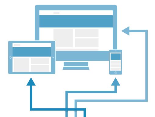
Websites are often bloated with heavy images which make browsing on-the-go a very disappointing experience. Web designers today must look for ways to optimize images so that they're quick to load on mobile and tablet devices. In this post we'll look into two methods to optimize images on your website.
Don't reduce the size of all images, optimize them!
The fewer bytes the browser has to download, the faster the website loads. This general rule is particularly true for smartphones which are often used where good connectivity is unavailable. Heavy images often create a bottleneck for mobile users increasing the time it takes for a page to load.
Google reports that mobile users will immediately switch to another site or app if it doesn't satisfy their needs. The majority of users who switch do it due to slow loading times. You want to make sure this doesn't happen due to heavy images used on your site.
The simplest way to solve this issue is by dropping all heavy images from your site and sticking to light, low quality photos and vector graphics. But, obviously, this means that all users will get an inferior version of the website.
There’s a much smarter solution: optimizing images based on server-side device detection.
Mobile optimization myths
Some less experienced designers may not be even aware that server-side device detection can be used to optimize only some aspects of the website instead of redirecting users to a completely different experience. The idea that you either build a responsive site or a separate mobile website is one of the common myths included in our latest paper, 8 Myths About Mobile Optimization.
Explore the most common misconceptions about building mobile-friendly sites that really improve UX on different devices.
Server-side device detection can be easily applied to any aspect of an RWD site, for instance, to optimize images. Using this approach some of the site's components may or may not be loaded according to the device information returned by the server.
Two methods to lighten images on your site
The issue of heavy images in RWD pages can be addressed in a number of ways, for example by using the new <picture> element and sizes and srcset attributes for the <img> element. But here we’ll focus on a much simpler approach with a little help from server-side magic.
In the first method we’ll show how to use device detection to optimize images when they’re requested by the browser so that their dimensions are reduced to an optimum for that device. The second technique allows you to use server-side device detection to decide whether images should be loaded or not.
Method 1: Resizing images
In this method we'll show how images can be easily resized using information provided by a device detection API. This method is also based on the mod_pagespeed tool, an open source project from Google which helps resize images so that no image is bigger than the screen it is sent to.
In our example, we use Apache server and a DeviceAtlas Cloud API which can be accessed either as a free trial or as a free option.
Step 1
First we'll need to install PageSpeed module which can be downloaded from this location. PageSpeed is a set of tools used to analyze and optimize sites following web best practices.
Step 2
Now we need to get a DeviceAtlas license. Just sign up here to download the DeviceAtlas Cloud library and copy the license key. You’ll need to put your license key in the DeviceAtlasCloud/Client.php file after unpacking the ZIP file.
Step 3
Copy the DeviceAtlas PHP file to a directory when it can be accessed by the web server. This example assumes that the directory is called DeviceAtlasCloud and it’s created in the root of the site. Then enter the following code at the top of your site’s HTML file.
<?php
include 'DeviceAtlasCloud/Client.php'; // instantiate client
$results = DeviceAtlasCloudClient::getDeviceData(); // fetch properties for current device
$props = $results['properties']; // store in $props
$width = (isset($props['usableDisplayWidth'])) ? $props['usableDisplayWidth'] : ""; // set $width to correct
?>
Step 4
The last step is to ensure that all images which need resizing have a width attribute set to use the $width variable, as in this example:
<img src="img/slide-01.jpg" width="<?php echo $width; ?>" alt="image description" />
The result of this is that the width of each image will be set from the $width variable that is automatically set to the maximum width of the screen. The PageSpeed module resizes the images, if necessary, and replaces them with resized versions (PageSpeed automatically keeps the aspect ratio).
Using this method, we were able to reduce the size of an example page by 75% (from 1027kB to 253KB) and decrease the loading time 2.3x (from 14s to 6s). Read our paper on RESS to learn more about the results.
Note: Of course only add this variable to images that require resizing. You probably don’t want to add it to images that are already small, such as icons etc. Also, the ‘width’ attribute for each image will need to play nicely with any CSS that you define for the image. If you’re using a CMS you may have to use a different technique for this depending on what access the CMS gives you to the underlying HTML.
Method 2: Loading selected images
The second method refers to a situation where some images don’t need to be loaded on some devices. A good example is the DeviceAtlas homepage.
On the homepage we have five different ‘hero’ images. There’s one default image and four additional images which change when the mouse hovers over a button. Of course this effect can’t work on touchscreen devices because there is no mouse interface.
Therefore there’s no point in sending five images to mobile and tablet users, when they can view only one of them. It would unnecessarily increase page weight and waste bandwidth. Here’s how we solved this problem in 4 steps.
Step 1
Using PHP, inject a class into the body tag which verifies whether or not the device is a touchscreen device. For this purpose we used DeviceAtlas' NGINX module setup (it's also possible with DeviceAtlas Cloud API with some code alterations).
<body class="<?php echo (isset($_SERVER['da_touchScreen']) && $_SERVER['da_touchScreen'] ? 'touchscreen' : 'nottouchscreen') ?>">
Step 2
In our JavaScript we used jQuery to detect if the body has the class of touchScreen. If so, it gives the variable “touchScreen” the value of true. Otherwise, the value is false.
var touchScreen = $('body').hasClass('touchscreen');
Step 3
We then lazy load the 'hero' images using JavaScript but wrap an "if" statement around the lazy load code which checks if the “touchScreen” variable is equal to true or false.
In our example the images will get appended to the bottom of the HTML element with the ID of “hero-banner”.
We also have variables that change from false to true for each image when they are loaded. These variables can be used to detect whether the image is loaded or not. When set to "true", these elements will be in the DOM and are ready to fade in when you hover on a button.
if(!touchScreen){
    // for 'Lazyloading' home hero images

    $.fn.imageLoad = function(src, class, f) {
        return this.each(function() {
            var i = new Image();
            i.src = src;
            i.onload = f;
            i.className = class;
            this.appendChild(i);
        });
    };

    // variables to read if different images are loaded for 'fade in on hover' function

    var opsImgLoaded = false, advertsImgLoaded = false, brandsImgLoaded = false, servicesImgLoaded = false;

    //Load image 1

    $("#hero-banner").imageLoad("/images/home/hero-mobile-operators.jpg", 'ops', function(){
        opsImgLoaded = true;
    });

    //Load image 2

    $("#hero-banner").imageLoad("[image path]", '[class name]', function(){
        [loaded variable] = true;
    });

    ... // Repeat the code above for more images
};
Step 4
The last step is to add CSS which sets the opacity to 0 for those images that fade in and out when you hover the mouse cursor over a particular section. This effect can be achieved using CSS, or an animating system such as jQuery’s Animate Effect, Velocity.js or Greensock.
After applying this method on DeviceAtlas homepage, we reduced the site's version for touchscreen devices by over 45% (from 531KB to 282KB).
Note: This logic isn't ideal for some devices that introduce themselves as touchscreen devices but allow mouse input as well.
Optimize images and all other aspects of your site
Image optimization is one of the many techniques you can use to speed up your site on mobile. Basically any aspect of your RWD site can be optimized to make sure that the user experience on different devices is optimal. This technique is also known as RESS (REsponsive web design with Server-Side components).
A higher level of optimization can be achieved using Adaptive Web Design which means that a different HTML/CSS is tailored for different buckets of devices.