

Adaptive web design (AWD) is one of the techniques of addressing mobile visitors optimizing their experience on smaller screens. While RWD might seem a standard approach today, for some websites going adaptive gives more flexibility in adjusting the content to suit mobile users and maximize revenues from mobile sources. Here are 10 inspiring adaptive web design examples.
What is adaptive web design?
Adaptive web design, or content adaptation is a website structure in which different website code is tailored for different buckets of users. This can be done using a single URL (Dynamic Serving), or with mobile-specific URLs. In both cases server-side device detection is utilized allowing the web server to verify what should and what shouldn’t be sent to the requesting device.
The adaptive approach helps with:
- Catering to the needs of different groups of users coming up with device-optimized website features, menus, images, texts, etc.
- Adjusting the website speed and page weight to suit users on varying connectivity and data plans
If you choose a responsive approach (RWD), device detection is not strictly necessary but all devices receive the same website code which is then rearranged client-side to fit the smaller screen. While this approach is hugely popular, it is not without its potential drawbacks such as heavier page weights and loading speeds. For this reason, the majority of eCommerce big-hitters prefer adaptive web design.
And here are some great examples including a variety of companies from different industries.
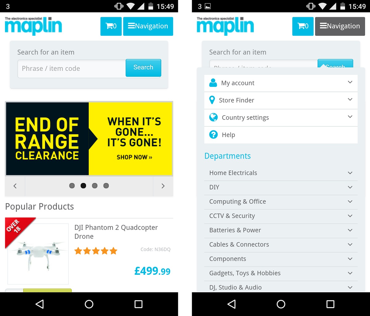
1. Maplin
Maplin.co.uk, a UK-based electronics retailer, has chosen an adaptive approach without a unique mobile URL. Mobile devices are detected and served a different version of the Maplin website optimized for browsing the products and making purchases on the go. The mobile website is lighter and faster than its desktop counterpart.
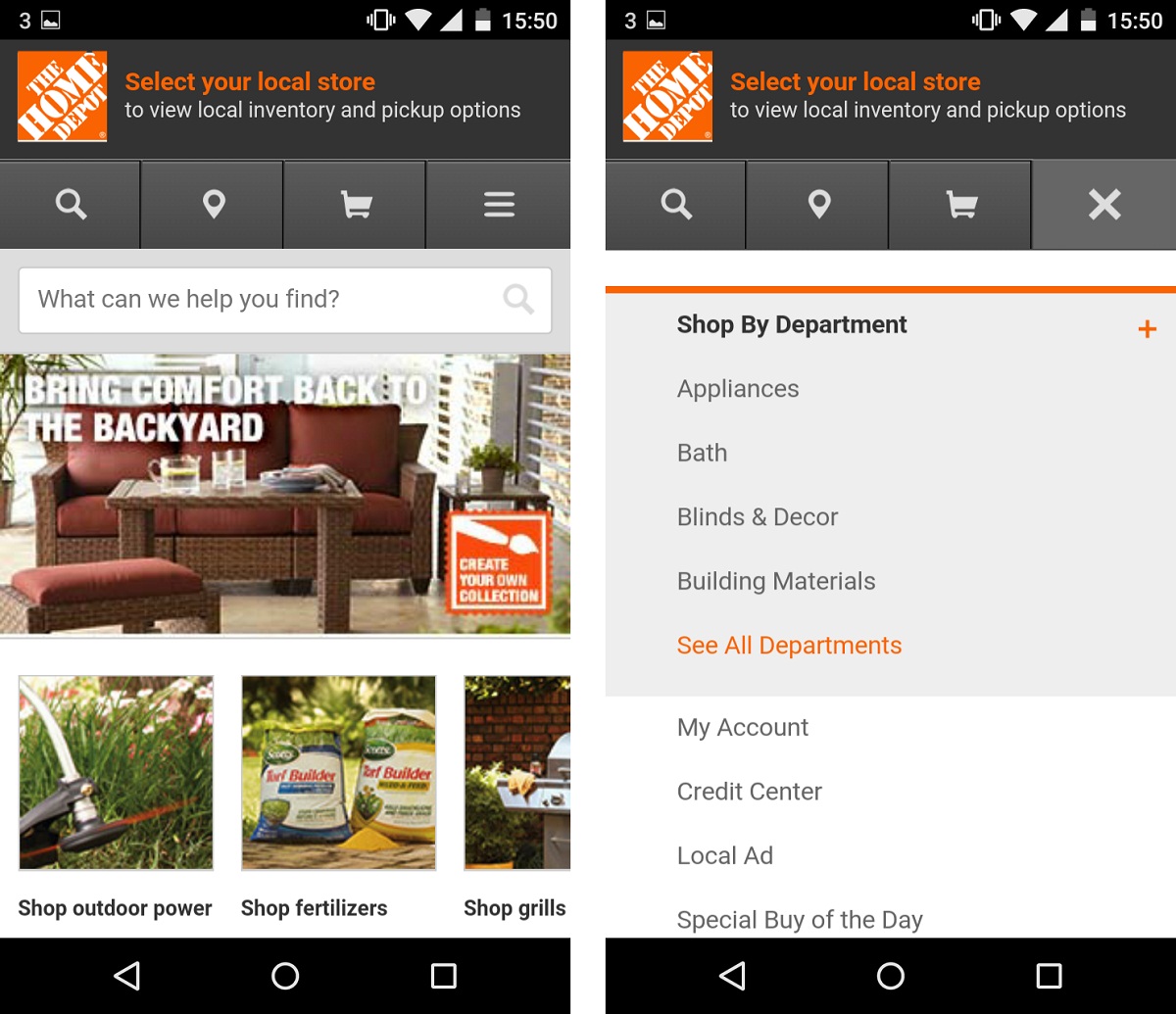
2. Home Depot
Home appliances retailer Home Depot also addresses its mobile visitors am adaptive website optimized for their needs. The website uses location sharing to detect a customer’s nearest store. It also allows users to access real-time store inventory and details on the aisle location of products.
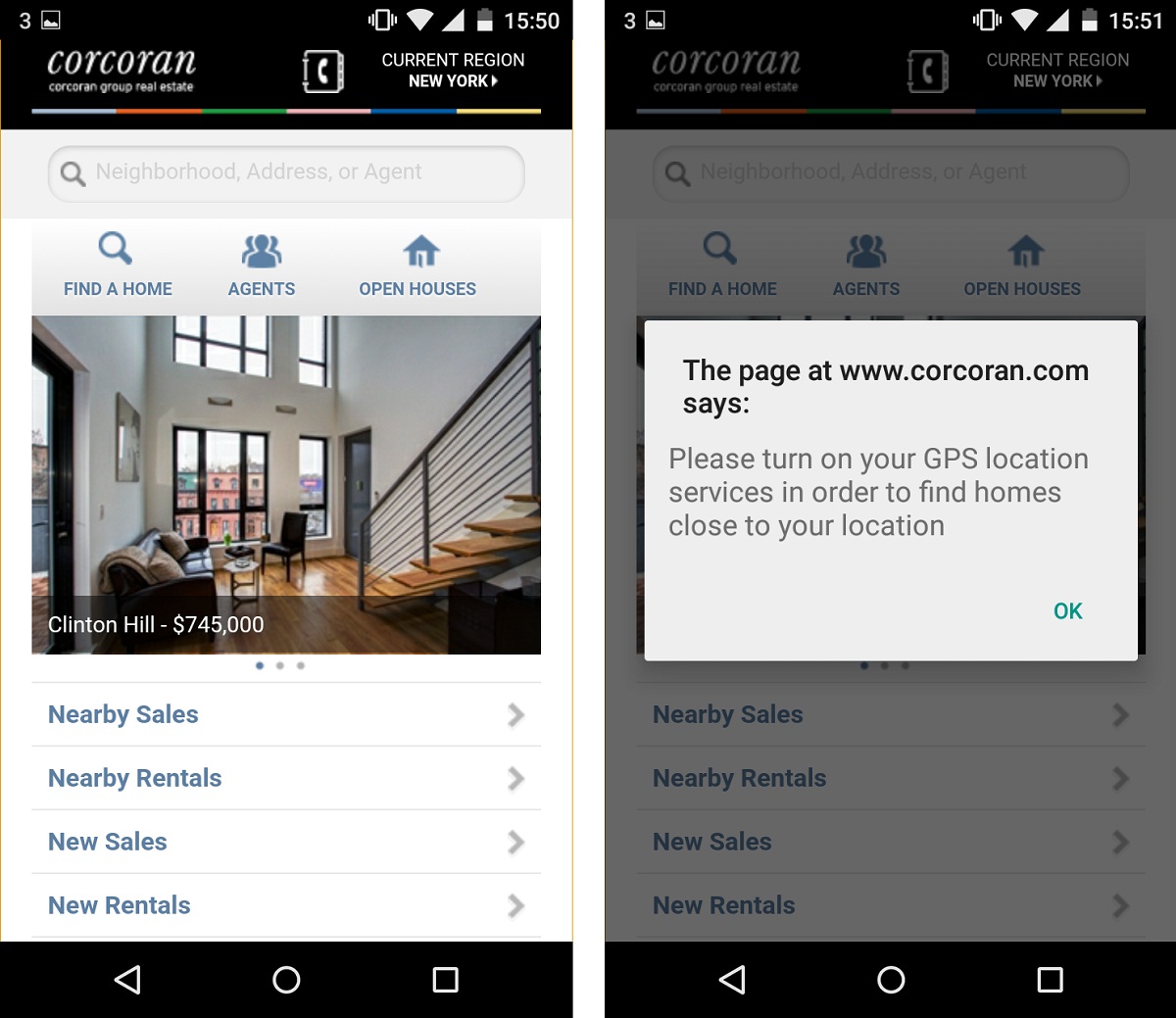
3. Corcoran
Corcoran, a New York real estate firm, utilizes location features to provide potential home-buyers and renters with a handy list of amenities near the searched property.
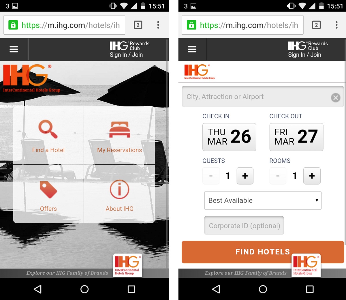
4. IHG
InterContinental Hotels Group has decided that mobile users are focused on quickly finding and reserving a hotel. Thus the mobile website encourages on-the-go local bookings through location services, serving up nearby hotels to customers based on GPS data from their phones. The mobile site is action-oriented, with quick-links to find a hotel nearby, review your reservations, and view current offers.
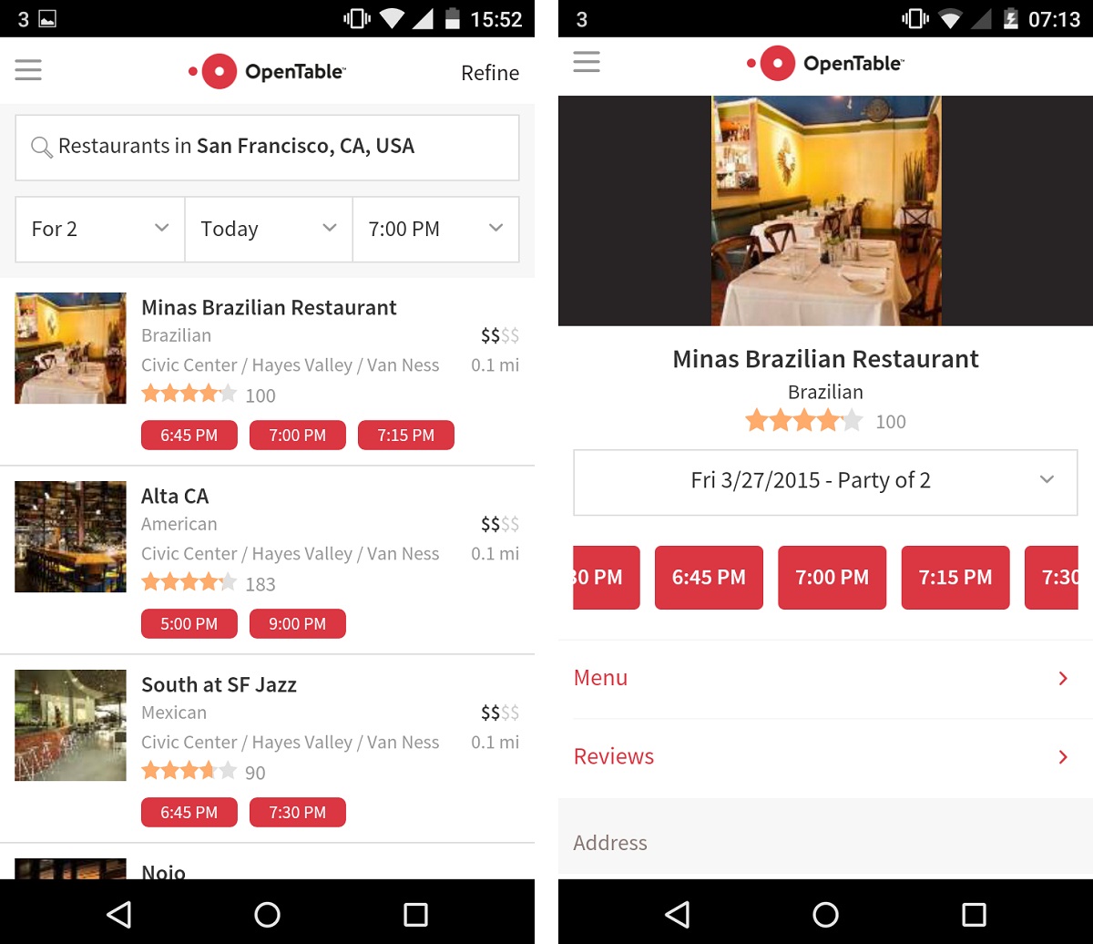
5. Opentable.com
The Open Table mobile site at m.opentable.com highlights location and contact details on mobile, while the desktop site emphasises reviews and browsing. Users navigate to the desktop site to choose somewhere to eat, and browse reviews before making a choice, while mobile users will be seeking actionable information such as:
- a phone number to call,
- a link to a Google map to work out directions to a restaurant from their location,
- parking information and nearby locations,
- a quick and seamless reservation process.
Clicking on the map will bring you directly to a route guide from your current location, while the phone number above is input into your phone’s dialler when clicked.
8 Ways to Boost Conversion Rate on Mobile
Download the free guide to learn about the best practices to get the most out of your mobile channels.
- How to build mobile optimized navigation, product filters, forms and CTAs.
- When it's okay to show less content on mobile devices.
- Why you need device awareness to truly optimize conversion rate on mobile.
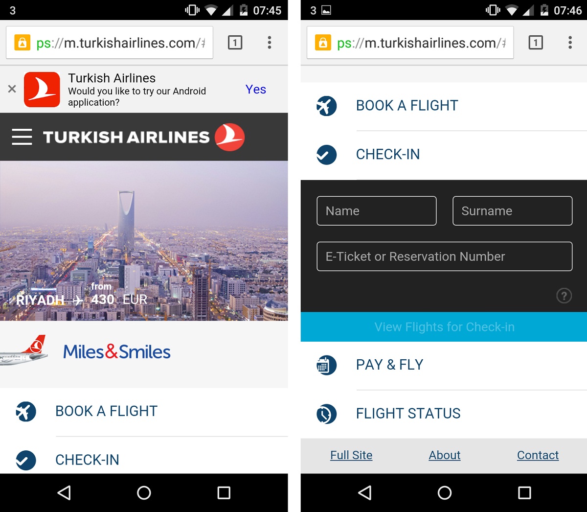
6. Turkish Airlines
Turkish Airlines offers its mobile visitors the choice of three different experiences. Users choose between desktop website, mobile website, and mobile app. Below you can see the mobile website which comes with a redesigned, streamlined look to fit smallers screens. Its designers highlighted features sought by travelers (online check-in, travel details), as well as all mobile users looking to book a flight.
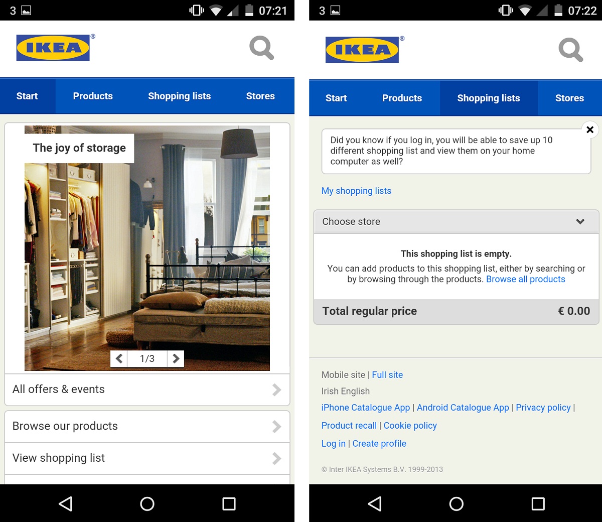
7. IKEA
Another neat example is IKEA's mobile website. It utilizes a smartphone-tailored version with streamlined menus and product browsing, also highlighting the shopping list option which on the desktop site is much less conspicuous. This is obviously targeted at customers who have their phones with them while shopping in a physical location.
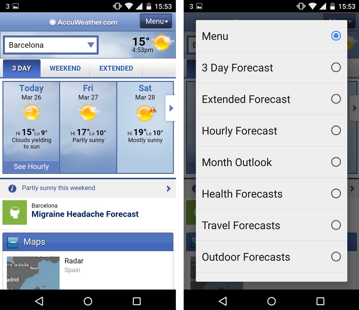
8. AccuWeather
AccuWeather serves mobile visitors an adapted version of its website. It comes with a revamped menu, more bandwidth-sensitive graphics, and a GPS-based ‘use current location’ option for checking the weather forecast.
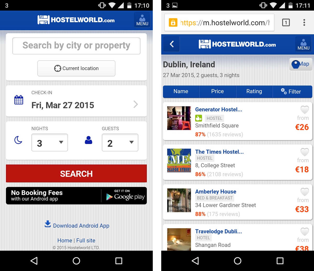
9. HostelWorld.com
Hostelworld.com is a yet another travel-focused adaptive website example on this list addressing mobile visitors with an optimized, adaptive experience. Hostelworld’s website features a mobile-optimized search engine including a GPS-powered ‘Current location’ feature.
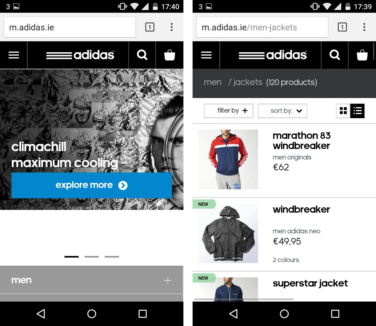
10. Adidas
Adidas provides its mobile visitors with a website that mimics the desktop website making a seamless experience. It comes with lighter images and simplified shopping process.
Page weight comparison
Optimizing your website for mobile devices helps you keep the page weight as low as possible. Here is a table comparing the page weight of the above AWD examples measured with Chris Pederick's Firefox extension.
| Website | Mobile Page Weight | Desktop Page Weight | Mobile to desktop ratio |
|---|---|---|---|
| Maplin | 1756KB | 1921KB | 1:1 |
| Home Depot | 1158KB | 1928KB | 3:5 |
| Corcoran | 1811KB | 4768KB | 3:8 |
| IHG | 1388KB | 2492KB | 5:9 |
| Open Table | 1131KB | 2252KB | 1:2 |
| Turkish Airlines | 1664KB | 3810KB | 3:7 |
| IKEA | 1388KB | 2492KB | 5:9 |
| AccuWeather | 1019KB | 3262KB | 1:3 |
| Hostelworld | 216KB | 900KB | 1:4 |
| Adidas | 2358KB | 4974KB | 1:2 |
As the Adaptive Web Design examples show, AWD is clearly a great approach for delivering lightweight, blazingly fast websites tailored specifically for mobile devices.