

Let’s Talk About Responsive Website Design
Many articles on cart abandonment mention latency and poorly optimized product pages, checkout flows, etc. as contributing factors towards lost sales. The remedy often suggested is to adopt a responsive design to allow browsers to tailor the page layout and structure based on the device accessing the content. This means that the page length may be bigger on a phone in which the user scrolls to view it, as opposed to a desktop where the screen is much wider and can accommodate more content above the fold.

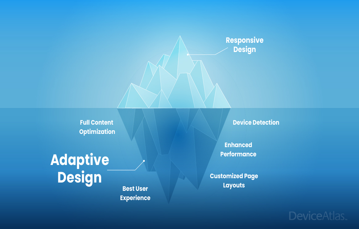
While this is certainly better than having the same page structure and layout regardless of device, responsive design (RWD) does not facilitate large scale changes. For example, it would not be possible to present a whole different interface to a TV vs what a tablet would see, or display an entirely different set of products if the user is browsing on a phone. Page weight is also a critical factor when serving content and this is especially important in RWD as oftentimes there is no change made to page size regardless of the device used (see data example below for supported claim). In this case, a 12 MB size website on a high-end phone could be the exact same size as it would be on a low-end phone.
The problem with this is that the gap between high and low-end phone capabilities is increasing, not decreasing, so a package of images and JavaScript that works great on a developer's phone might bring a low end phone to its knees. Loading time comparison is crucial here, particularly when images account for the highest resource type across page weight, followed by JavaScript.

What About Adaptive Design?
Adaptive design, on the other hand, allows the website owner to create several completely different page layouts for every device that the website is visited from to improve the user experience. Although more time-consuming for designers and developers, server-side adaption allows more control over the content that is served to each device. Imagine being able to create a web page with content unique to the visiting device type, e.g. ‘Phone covers for your iPhone 13 Pro Max’ or showing only one app store download button depending on which OS a phone is using: ‘Download our App on the Google Play Store.’.
Responsive vs Adaptive in eCommerce
While RWD is by no means bad, eCommerce retailers could do a lot better! If we know that latency and poorly optimized pages have a direct correlation with cart abandonment, shouldn’t the focus be on preventing these issues to improve conversions? Ultimately, performance equals reach; the better a website performs the more people can use it regardless of their device, bandwidth etc. RWD can perform layout tweaks and (sometimes) image sizing, but AWD can provide an entirely different experience per device type, offer lighter experience for weaker devices, etc. The possibilities with AWD are far greater than with RWD which will have very limited knowledge of visiting devices.
We wanted to learn more about responsive vs adaptive design in eCommerce, particularly as user experience has a significant impact on bounce rates, lost conversions, etc. So we analyzed over 200 of the top eCommerce fashion sites based on industry data from ZoomInfo to uncover which websites were serving the same content to visitors irrespective of the device, and which were using server-side adaption to deliver varying page sizes, products displayed, general navigation, etc. based on what device was visiting.
The Top 10 Players are Adapting
From the data we can see that the top 10 Commerce websites globally (based on revenue turnover) are all using server-side adaptation of some kind. Below is a breakdown of these websites and how page size varies by HTML weight, image count, image weight, script count, and link count. Click on the image to view the full size:

What’s surprising is the number of eCommerce fashion websites that do not use server-side adaptation - see the full dataset here. Whether this data is meaningful or not in terms of internal metrics around bounce rates, cart abandonment, etc. is impossible to know, but it’s clear that the top online retailers are adapting content to suit specific devices accessing their websites. This indicates a high level of optimization effort being made to improve user experiences – something which market leaders will certainly strive to achieve to differentiate themselves from competitors.
It's important to mention that many of the bigger eCommerce websites are often built using customized platforms which offer more flexibility in terms of server-side logic. Off-the-shelf CMS platforms like Shopify offer purely responsive designs so the website owner is restricted by what’s available with the template. It wouldn’t be possible to serve an entirely different set of HTML to mobile phones vs tablets vs desktop using a CMS like Shopify. Though it’s also widely known that Shopify specializes in catering to smaller eCommerce merchants where responsive design might be sufficient for their needs. Larger, commercial eCommerce platforms such as Oracle support responsive and adaptive design which provides more options for web developers.
See below how Amazon India serves completely different content to a Firefox browser running on V108 vs a Realme C3 mobile phone (Realme being one of the top 5 most popular smartphone brands in India currently).
Amazon.in page size on Firefox V108

Amazon.in page size on Realme C3

On the Realme C3 device, the page isn’t even half the size of what it is on the Firefox browser and many images have also been substituted for HTML.
Amazon.in = Firefox v 108 Total Size: 6.94 MB JavaScript: 998.40 kB Images: 4.70 MB (331 images) HTML: 632.39 kB CSS: 542.69 kB Amazon.in = Realme C3 (released in 2020) Total Size: 2.96 MB JavaScript: 1.36 MB Images: 416.94 kB (76 images) HTML: 733.28 kB CSS: 346.80 kBConclusion
RWD is a positive move towards improving the user experience but it's just the start. AWD is capable of so much more and optimizes for the best possible user experience vs only making layout tweaks and perhaps some image resizing. Based on the data analyzed, it’s clear that any eCommerce retailer hoping to compete with market leaders must consider adaptive website design to maximize the user experience - something which we already know has a direct correlation with cart abandonment. While RWD is certainly a step in the right direction, it’s really just the tip of the iceberg...