

As with so many other industries, the increasing usage of mobile devices worldwide has had a profound impact on e-commerce. Whether a purchase is made in the store or online, mobile features heavily in the consumer decision-making process. It is predicted that mobile commerce will be responsible for 59% of total retail eCommerce sales, accounting for an massive $4.01 trillon in 2025.
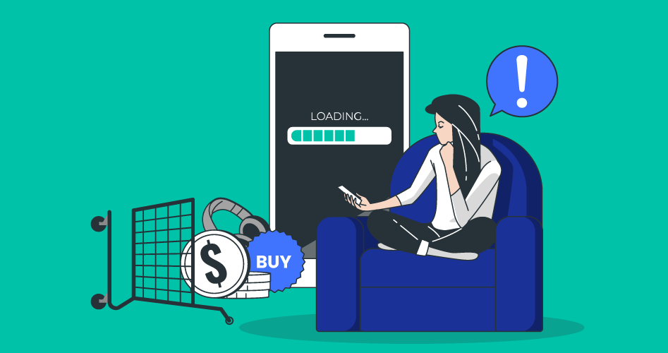
Despite its rapid growth, m-commerce still presents significant challenges for online retailers. For example, mobile users are typically more demanding and less patient. Google found that the probability of bounce rates increased by 123% whenever delays in webpage load time occur within one to 10 seconds. Worryingly for retailers, the data shows they are still not meeting consumer expectations, with conversion rates and add-to-cart rates highest on desktop as opposed to smartphones and tablets.
Explaining the discrepancy between mobile vs desktop conversion rates
There are several reasons why mobile users convert less than desktop users. One reason would be the lack of buying intent. Mobile devices are mainly used as a research tool in the decision-making process as opposed to the final point of conversion. Tasks occurring early in the sales funnel such as product comparisons, reading reviews and finding prices are typically done on a mobile device before a completed transaction takes place in store or on a desktop.
Mobile users are also subject to more distractions, whether that be something happening off-screen or getting push notifications from different applications. Desktops are primarily used in quieter spaces such as the office or at home. The device we choose to use at a particular time is driven by the amount of time we have or need in that moment, the goal we want to accomplish, our location and our state of mind. In a nutshell, a person on a mobile is fundamentally a different consumer to the one they are when on a desktop.
While these reasons are very much specific to general mobile behavior, there are technical ways for retailers to turn this lack of buying intent into an appetite to explore more and convert seamlessly on a mobile device. As reported by DeviceAtlas, mobile device fragmentation is a growing headache for businesses as users can access online content on a myriad of devices with different capabilities, screen sizes, OSes, browsers, capacity etc. This means that it is vital for businesses to handle their device traffic optimally by tailoring experiences appropriate to a user’s device. This is a particularly pertinent issue for online retailers who rely on graphic-heavy websites and complex web designs to advertise their products.
Transforming your mobile commerce performance with fast and accurate device insights
Screen Size
As mentioned, the mobile landscape is made up of thousands of devices with distinctive features that can affect an e-commerce website's performance on mobile. By getting a deeper understanding of how your visitors interact with your website at device level, you can provide a seamless mobile customer experience throughout the digital journey in real-time. Take a user's screen size for example. Research has shown that users with large-screen devices are more likely to complete a purchase or fill out a form than users with smaller screens. With real-time device detection in place, you could adapt content for small-screen users such as presenting less form-fields, altering the navigation menu and showing only the most important content for product descriptions.
Load Times
Another important factor is slow load times which can greatly affect performance on mobile. DeviceAtlas found this to be the case in their analysis of 15 e-commerce sites. Their results showed that the home page of each site loaded an average of 87 resources and 1.9MB of data. Because the right content isn’t always served to the right device, conversion rates can drop. Typical causes of slow load times are tons of images, CSS and JavaScript which effectively kill any chances of mobile conversions so online retailers need to keep these as lightweight as possible.
To limit the payload size, you can use server-side device detection to select the right website components that work and look great on the user’s device. Employing server-side detection will ensure that your website loads with minimum page weight and maximum load speed which can help deliver a frictionless checkout for each connected device.
Connection Speed
With mobile users typically ‘on-the-go’, a slow connection speed can prevent them from doing even the most straightforward of tasks on a website. While 4G and 5G is widespread, many people are still on lower connections and in busy areas, 4G can quickly be overwhelmed. It certainly becomes a greater challenge for users to browse through products online efficiently and fill in payment and shipping details. The result is increased cart abandonment rates and lower conversion.
Although dynamic in nature, it is possible to measure a device's connection speed in real-time. This information can be used to determine the size of the assets to transmit to the visitor's device. For example, if network performance is poor, the decision can be made to send lighter images or reduce the amounts of JavaScript and CSS delivered so that web pages load in an acceptable time frame.
Who is doing it right?
Ebay, one of the largest ecommerce businesses in the world, make sure their web content is truly device-optimized for all users on all devices as screen space for all auctioned products is at a premium. For example, the desktop version of the site presents large hero banners that display prominently on the home page. They also have a very wide navigation menu of all the types of products available.
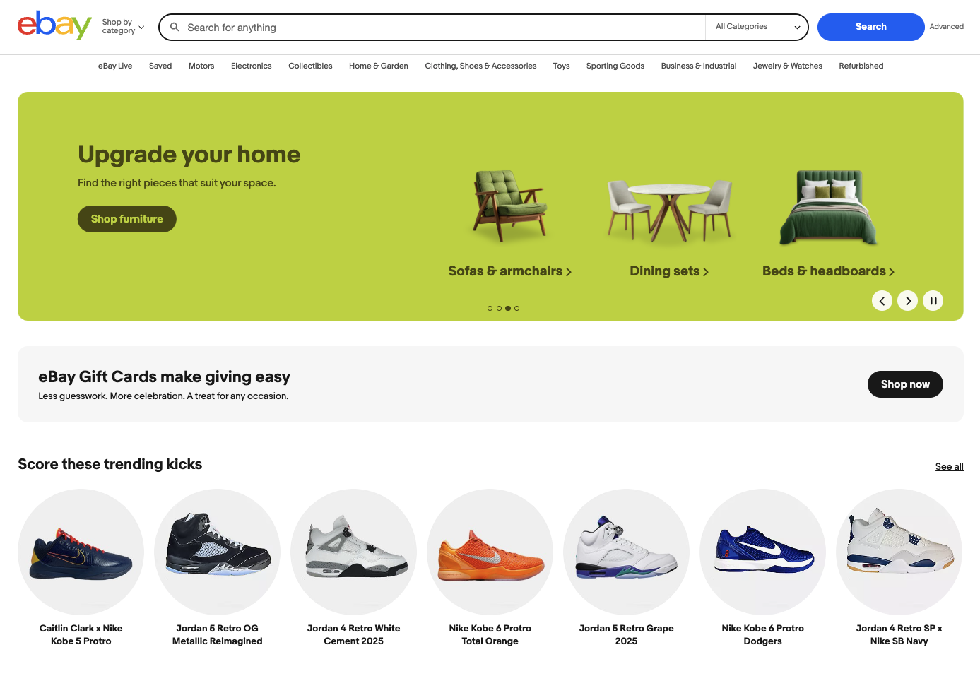
When you enter ebay.com on a mobile device however, you are immediately directed to the mobile website of ebay.com.

This version is designed around clickable tiles (product photos) promoting selected items. The large hero banners are gone on mobile and so is the large menu—on mobile they're available under "All categories" at the bottom of the page.
For more examples of top e-commerce websites using device detection, check out our blog post here.
Try out local device detection
With a range of devices and user contexts, mobile audiences require a fundamentally different approach to maximize mobile revenues and conversions. Because audiences today are extremely sensitive to your website's performance, any slow loading pages lead to poor user experiences, fewer visits and fewer conversions which in turn impacts your bottom line.
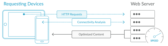
You can identify devices in real-time by analyzing the User-Agent (UA) string sent by the browser which informs the web server about the visiting device. The UA string tells you quite specific information about the software and hardware running on the device that is making the request. You can then make decisions on how to handle that device by analyzing the request locally using an API and a locally installed data file.
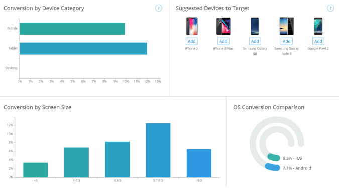
Leveraging a local device detection solution is a future-proof way to correctly handle all devices accessing your site and actually see typical online behaviors that lead to won and lost customers. For example, see DeviceAtlas' dashboard below which gives clear insights to conversion rates.
Conclusion
In today’s mobile-first world, optimizing m-commerce performance requires more than responsive design, it demands real-time device intelligence. By using local device detection to understand screen size, load speed, and connection quality, retailers can deliver tailored experiences that load faster and convert more effectively on every device. As mobile fragmentation continues to expand, those who harness these insights will not only reduce friction and cart abandonment but also transform mobile interactions into seamless customer journeys.