

It's been a while since we examined the progression of the world's most popular e-commerce websites. How are they addressing a complex landscape in 2018, and serving (optimized) content to a huge variety of visiting devices?
As mentioned in our post from 2017 , the most successful e-commerce sites tend to favour adaptive design over responsiveness, as it allows them to create a unique and user-focused experience for all devices. Pure responsiveness simply shifts elements around on the user's screen, elements which could be too heavy, use a lot of bandwidth/data, and may not fully render at all. By opting for the adaptive route, their servers know the requesting device before content is sent, reducing waste and bloat at every stage of the process.
This leads to an improved visitor experience, which is naturally a positive thing for an e-commerce company. DeviceAtlas helps some of the world's biggest brands optimize their content in an increasingly diverse device landscape. Our ROI Calculator can even give you an estimate on the potential gains to your bottom line as your website performance improves.
Research suggests that, still, the majority of us feel more comfortable entering payment details on a larger screen. Whether it's the potential for making mistakes, the perceived insecurity, or the clunkiness of navigating between and comparing browser tabs, mobile conversions still lag behind desktop by over 2% in some cases.
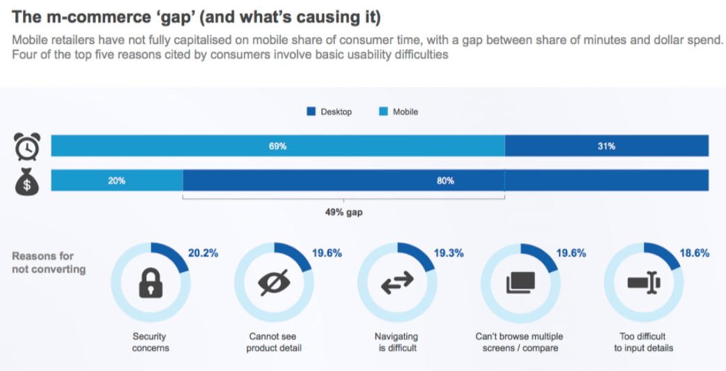
This gap is a potential bonus for operators of adaptive and well-designed mobile sites. Tablet users will also feel the benefits, as a slightly larger screen allows a more visual experience to be delivered. Whether tablets get the full desktop version or simply enlarge elements of the mobile site depends on the actual screen size of the visiting device, which can be detected and acted upon in real-time using DeviceAtlas.
Let's take a look at ten of the most popular e-commerce sites in the world, and see how adaptive design allows them to optimize their websites for all devices.
We're comparing pages from these sites on desktop (Chrome/Windows) with an iPhone 8 (using Chrome's Developer Tools emulator). The mobile site is to the right of each image, highlighted in blue.
Amazon
With over half a million employees across the planet, and revenue of over $170 billion in 2017, Amazon has taken the concept of selling over the internet to a whole new level since its inception in 1994.
Now the 10th most visited website in the world, Amazon.com has clearly put a lot of thought, sweat and effort into making their website appeal to users regardless of the device used to navigate there. They even cater to feature phones, with a minimal version for those on a more basic device incapable of rendering heavy images and complex interaction.

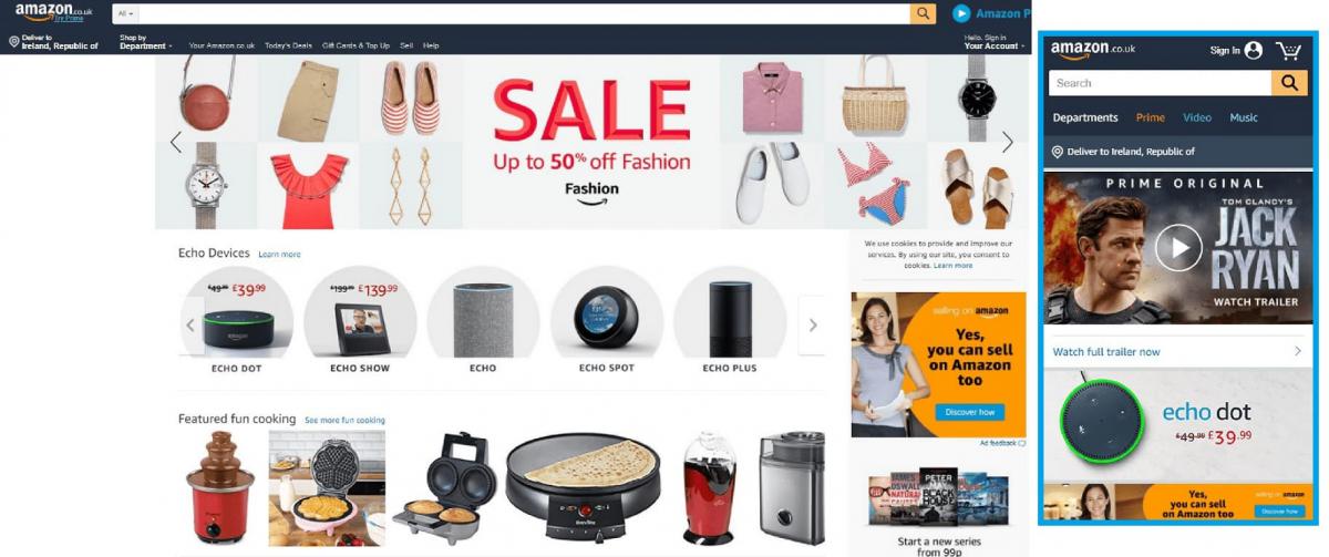
There's no redirect involved either, as mobile and desktop visitors alike land on https://www.amazon.com.
The first screenshot shows some simple yet effective adaptive solutions. By stripping a lot of detail from the homepage, a mobile visitor has a much clearer range of choices. The search bar is made more prominent, while the menu is reduced to some clearer options - Departments, Prime, Video and Music. All other areas of the site are accessible from these four navigation links.
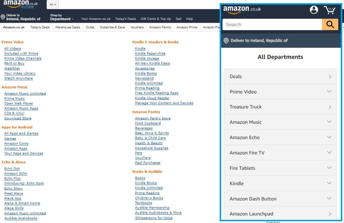
The next comparison shows how e-commerce sites tend to handle menu links on mobile devices. Instead of a cumbersome mega-list of all departments and categories as we see on desktop, Amazon have employed a simpler, cleaner, nested version for mobile visitors.
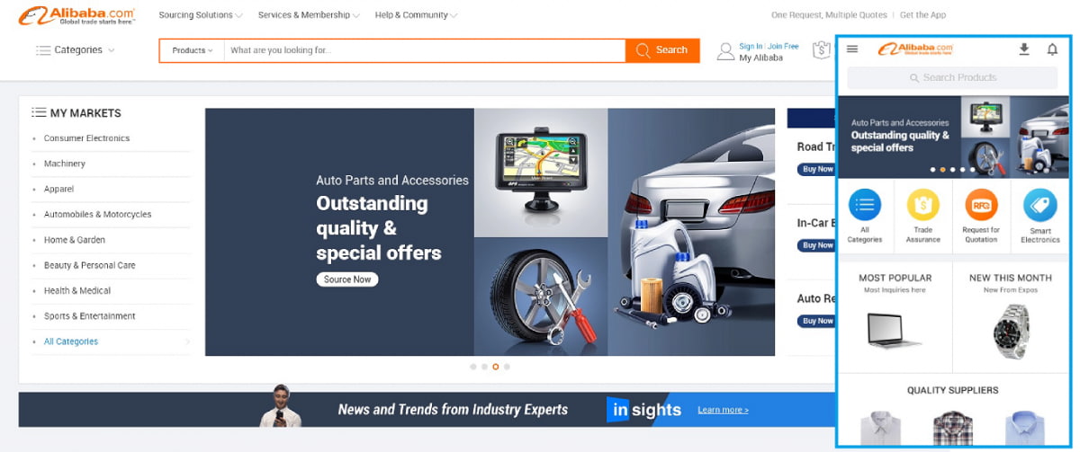
Alibaba
Founded in 1999, Alibaba has grown to outgun Amazon and eBay combined, with a market cap of $536 billion as of January 2018.
Despite their e-commerce success, or perhaps as a result of it, Alibaba have set their goals beyond merely selling. In 2014, their purchase of UCWeb, a Chinese mobile internet firm, signalled the birth of a major player in the web-space, and every space that touches it.
It can be no surprise to see their website performing beautifully on all devices. Mobile visits are redirected to a dedicated URL - https://m.alibaba.com.
As per the image below, the mobile homepage mimics the content of the desktop version, but restricts the featured categories to the very top of the page.
Beneath, we see the "All Categories" link before we head into a list of categories, special offers, most popular etc. The search and menu bar remain static as a user scrolls down the page, so it's almost impossible to get lost.
The page ends rather abruptly, but as the menu remains as you scroll, it's far from a fatal flaw.
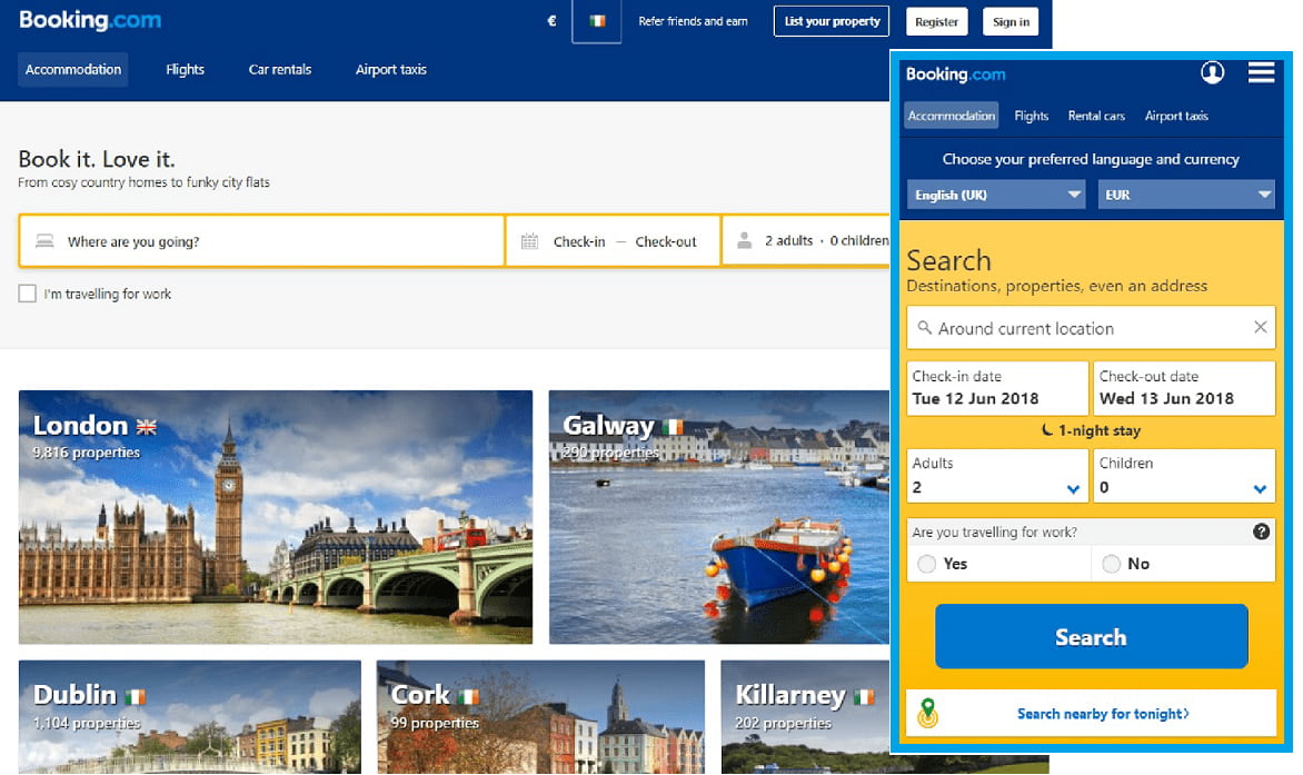
Booking.com
Booking dot yeah!
Since 1997, Booking.com has been at the forefront of the online travel revolution. By aggregating pricing and options from a huge range of travel agents, car hire groups, hotel chains etc, a new business model was born. With revenue of over $12 billion in 2017, it's working.
Given how people usually search for holidays, flights and hotels, a smooth and efficient mobile experience is vital. Like Amazon, Booking use a single URL for all visiting devices - https://www.booking.com.
Booking.com have subtly managed to keep visitors on the right path to conversion, by featuring the important variables - destination, dates, number of people - front and centre of their mobile homepage. By getting these details out of the way early, the subsequent steps are narrowed and refined, maximizing the chances of a successful conversion.
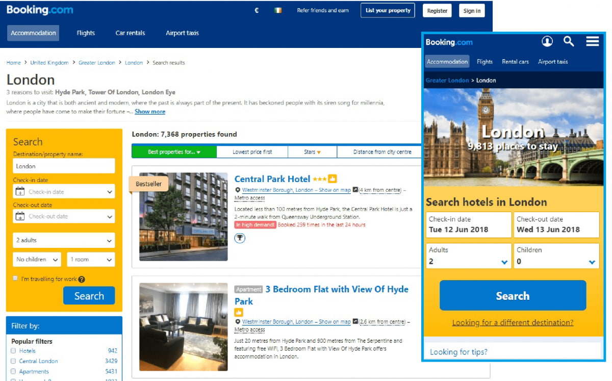
The site also offers city guides, reviews and activity suggestions. Beneath the search function, there are links to these guides. When clicked, the user again lands on a page which prompts them to enter dates of travel and total number of travellers, and hit "Search". This is repeated until you enter date, which then alters the results shown.
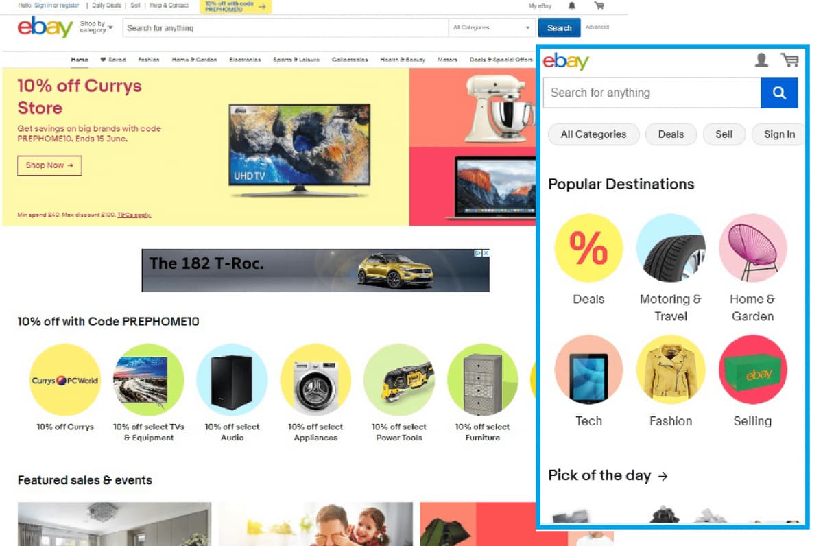
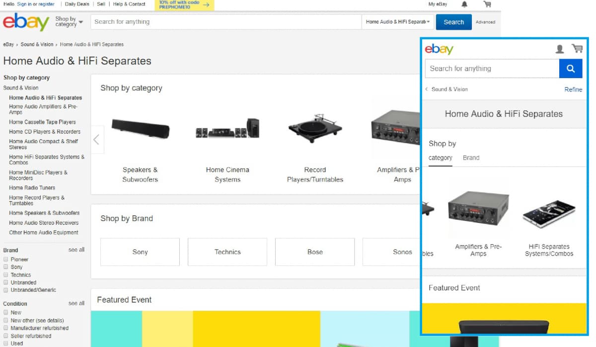
eBay
Synonymous with all things online-commerce related, eBay began in 1995, and remains one of the few survivors of the now-legendary dot com bubble. It also pioneered the concept of the online auction.
Not only did it survive, it recorded revenue of over $9.5 billion in 2017. Not bad for a bubble.
Unfortunately, as of 2017 eBay no longer offer the most basic form of mobile website for lower-end devices, despite Amazon maintaining the same.

The eBay mobile website is no longer supported on this device. Access all your eBay activity from your desktop or a supported Apple, Android or Blackberry mobile device.
eBay redirect their mobile visitors to a dedicated mobile subdomain - https://m.ebay.com. From the images below, we can see how they've ensured their mobile site looks and feels like their desktop version.
Category pages also reflect the desktop experience, with some horizontal scrolling allowing a user to scan the items and sub-categories.
While there's no menu available on mobile, in the traditional sense, the search function remains visible throughout.
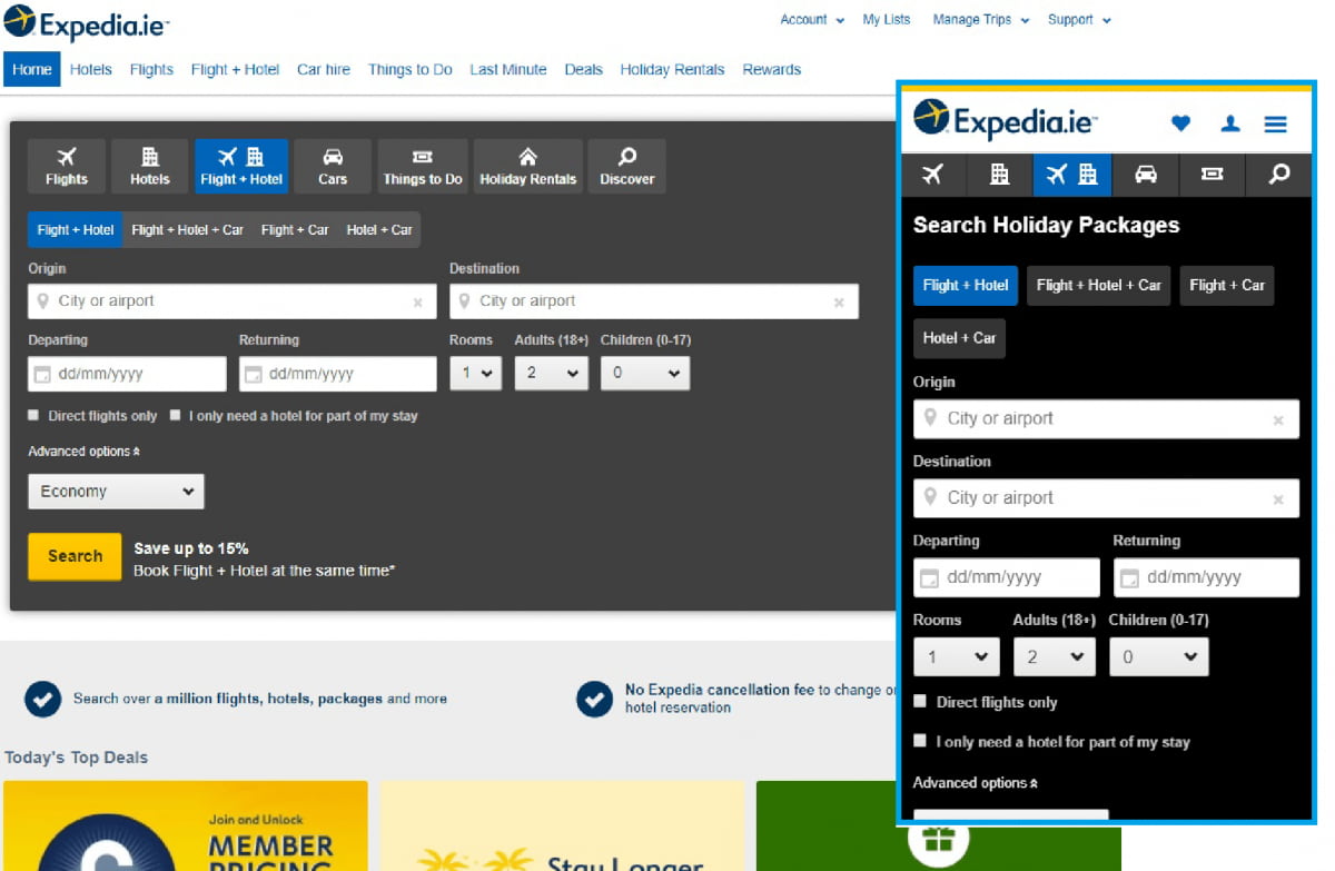
Expedia
Like its counterpart Booking.com, Expedia serve their website to all devices on a single URL - https://www.expedia.com.
Front and centre upon loading the page is the Flight & Hotel search function, prompting visitors to begin their search straight away. "Today's Popular Destinations" and "Top Deals" feature beneath the search forms, with images of exotic locations tempting you to explore further.
The homepage ends with a sitemap of links, handy if you still haven't found your destination of choice.
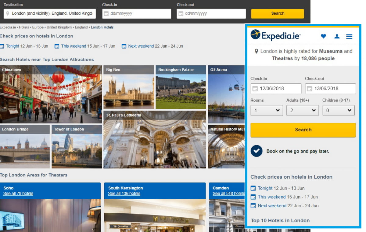
Landing on a destination page (below - London), gives you all the options you'd expect, as well as tourist-related information, such as local attractions, airports and a map of the region with selected hotels highlighted.
Favourite, Profile and Menu links remain at the top of the screen as the user navigates, making it easy to get back somewhere relevant should you get lost down the content rabbit-hole.
Expedia, like Booking.com, have refined their mobile experience to make it very easy to book a hotel, flight, rental car and even book local attractions and day tours around the region. By providing supporting content around each option, and making it as easy as possible to find, navigate and digest, the Expedia mobile web leaves little room for improvement.
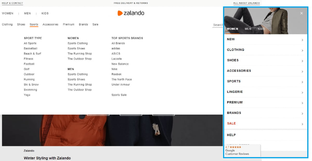
Zalando
Positioning itself as "the world's best online fashion experience", Zalando leans towards large, bright images to convey its fashion-ness.
Maintaining a single URL for all visitors - https://www.zalando.com - the mobile version sticks to the same theme as the desktop, but shows less elements in each section and utilises horizontal scrolling to enable the endless browsing that online shopping tends to encourage.
One element retained in the mobile version is the large block of text near the end of each page. By using a single URL for all visitors (instead of redirecting to an m.zalando.com subdomain), the value of this targeted text - including links to other categories - allows the SEO benefit to spread across their site and not be diluted where mobile search is used.
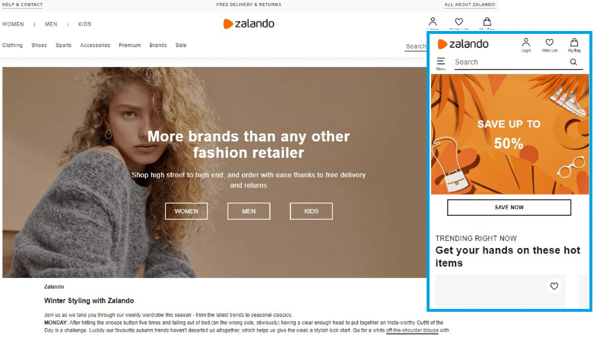
The menus reflect the desktop version, but perform beautifully on mobile. A single hamburger button beside the header search field keeps the style consistent regardless of the page you may be on, and also makes navigating to other sections as easy as possible.
Individual product pages don't try to overwhelm the user, which is nice. Beneath each item's images, description, size options etc are three sections - "Complete the look", "Similar items" and "You might also like" sections, where horizontal scrolling allows more easy browsing. This also means the menu bar - which doesn't follow a user down the page - isn't too far away, and a brief flick of the thumb brings you back to the top of the page to begin another search.
Groupon
With almost 50 million active customers, Groupon has saved shoppers more than $28 billion in North America alone. Launched in 2008, it had revenue of over $3 billion in 2016.
Born out of frustration at trying to cancel a mobile phone contract, founder Andrew Mason realised the power of collective bargaining. What eventually materialised was the largest internet company IPO since Google.
The nature of the business lends itself well to the mobile experience. An endlessly-scrolling homepage lists all the offers for a given location, while the discreet menu bar follows so the user doesn't get too lost in a sea of offers.
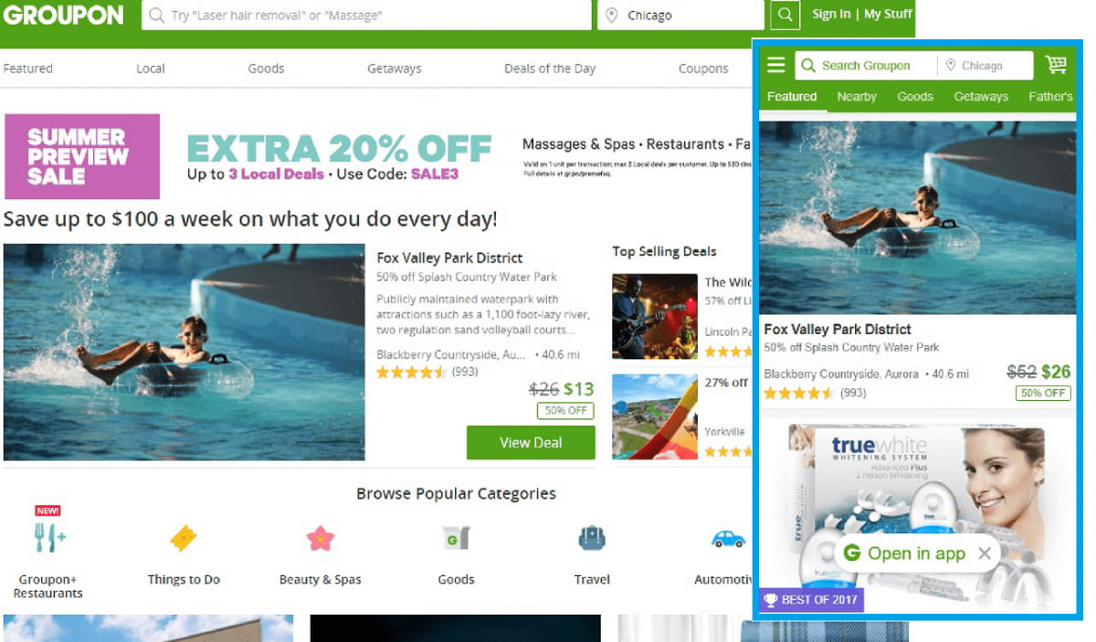
As with all good mobile websites, the menu is a vital feature on a smaller screen. Groupon do it right, reflecting the logical taxonomy of the larger desktop menu. Clear, well spaced text makes finding the right category as easy as possible.
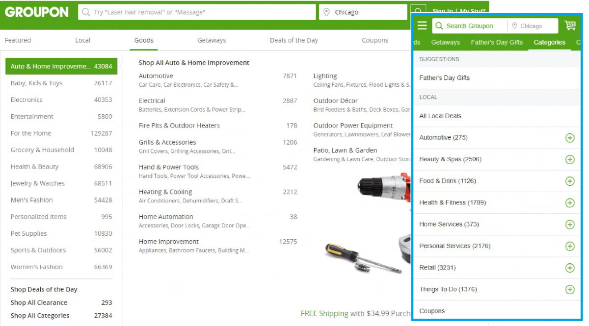
On individual offer pages, however, the menu isn't replicated, and is replaced with a back button, a notification icon and a "share to FB/Twitter/Email" option.
There's also a popup at the end of the page, either shouting "Buy! Limited Time Remaining!", or a more legitimate "sale ends in..." counter. This feature is a lot less intrusive on the desktop website.
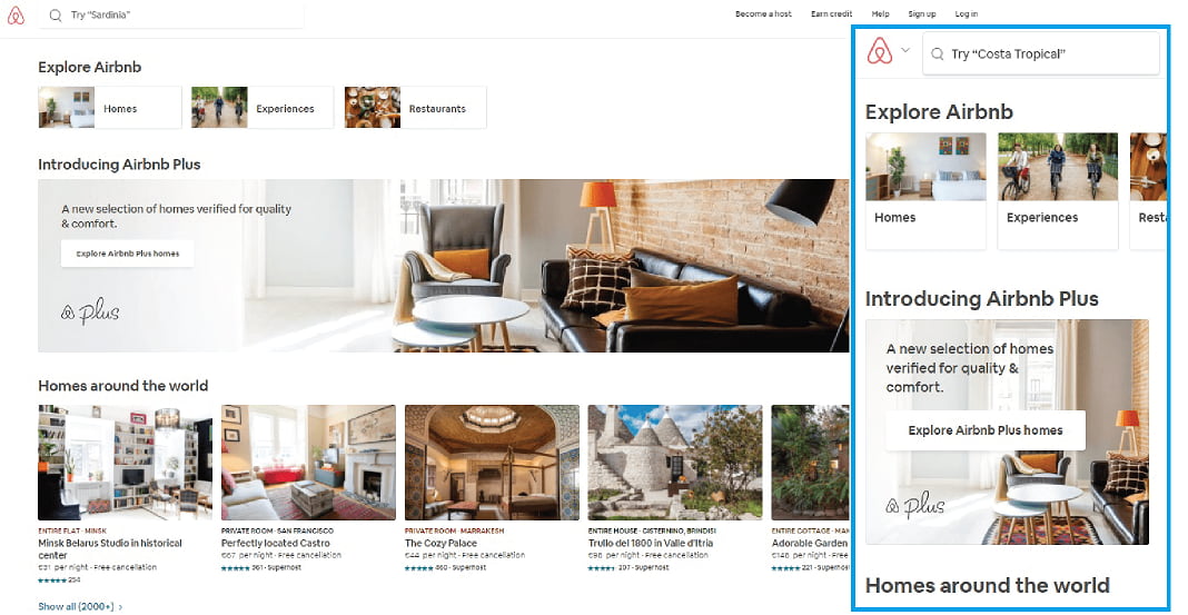
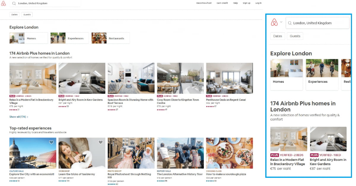
Airbnb
Since 2008, Airbnb has disrupted the hotel marketplace by providing rooms, houses, apartments and everything in between to travellers seeking an alternative to traditional hotel stays. It's also enabled Joe Public to earn some cash by letting out their spare rooms or holiday homes, earning a small fee on each booking.
These small percentages helped Airbnb reach revenue of $2.6 billion in 2017.
As with other examples in our list, the business matches perfectly with mobile browsing. While evidence suggests most people prefer to do the important stuff on desktop - the actual booking and payment side - the discovery phase is still a mobile-centric process. Airbnb encourage this well on their mobile website. Using crisp imagery throughout, and with plenty of content around "Experiences" and user generated reviews, the homepage is an ever-scrolling list of cities' available homes to rent and aforementioned "Experiences".
Airbnb isn't quite as pushy when it comes to entering details such as dates and number of guests, taking the softer-sell approach by providing lush content about each and every location. This reflects the product itself, as potential visitors to a city may feel less inclined to book a private home without reading a little bit more than the average hotel booker might require.
Thankfully, the menu remains visible while scrolling on location pages, otherwise it may require a bit of scrolling to get back to the top of the page. Differing from other simliar mobile sites, the menu doesn't give much in the way of destinations or accomodation types - pushing the user to manually enter their preferred destination.
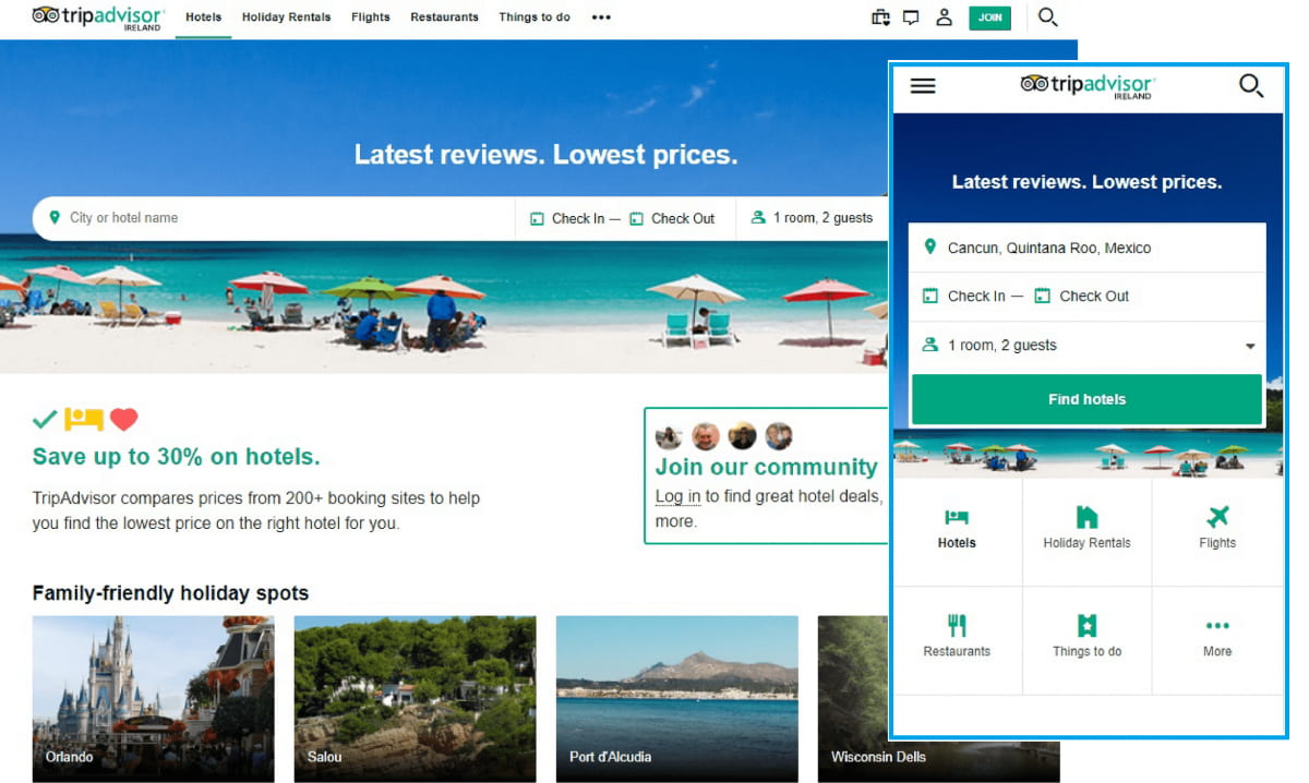
TripAdvisor
TripAdvisor is a US based travel and restaurant booking website. Reviews, stories and forums are central to their offering, providing potential travellers with as much information as they could possibly want before making a decision.
It's the largest travel site in the world, with over 315 million members and 500 user-generated reviews and opinions. This fact is key to how they mould their mobile web experience - users need to be able to interact with their content, and not simply scroll through pretty pictures before booking.
The mobile homepage is simple and clean, providing the usual search function we're used to seeing on such sites. Beneath that, tiles represent the menu bar seen at the top of the desktop site.
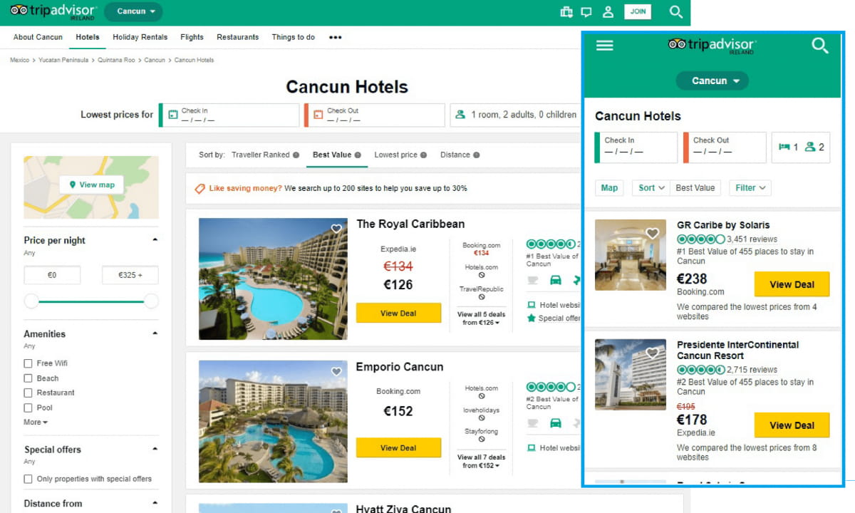
Scroll down, and you get the same content blocks as seen on the desktop version.
Selecting a location, or indeed a restaurant, hotel or activity, is where TripAdvisor shows its value. The layout of these pages on mobile is similar in function to the desktop version, allowing you to view photos (both professional and user-generated) easily and without interrupting the flow. The page then leads to the Reviews section, with the three most recent user reviews displaying on mobile, compared to five on desktop. The "view more reviews" button makes further reading easy.
The hamburger menu acts as the desktop nav-bar throughout the site, and provides a link to the main areas of the site - Hotels, Holiday Rentals, Flights, Restaurants, Things to do. It also has a "Recently viewed" link, which is a great idea considering the sometimes fiddly nature of managing multiple tabs on a mobile browser.
I found the "Check In/Check Out" fields popping up on every page load a little annoying, as many users may not have exact dates in mind while browsing. That small issue aside, the TripAdvisor mobile website is a clean, functional replica of a desktop experience that was already rather good.
ASOS
Founded in 2000, Asos has grown at a phenomenal rate, with separate websites catering to the UK, Australia, USA, France, Germany, Spain, Russia and Italy, as well as delivery options for over 140 countries.
Asos appears to have understood the value of mobile customers long before their competitors caught on. Their app has over 10 million downloads, and according to a Digiday feature, 70% of their global traffic, and 58% of purchases take place on a mobile device. While the app certainly helps these numbers, we're looking at the mobile web experience only.
Mobile users get redirected to a dedicated (non-https!!) URL - http://m.asos.com. The landing page prompts the visitor to choose "shop women" or "shop men".
From there, the mobile site follows the desktop version in terms of content blocks and flow. Landing on a category page, such as "Men's Nike" below, the full range of sorting options are reduced to two buttons on mobile - Sort and Filter. Presumably to save space, these work quite well and provide the same options as the desktop variety without sacrificing prime screen real estate.
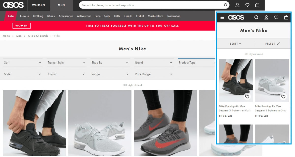
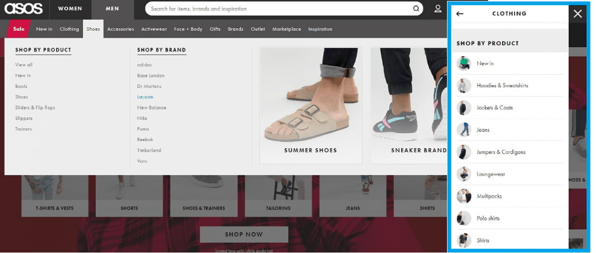
As with all successful mobile websites, the humble hamburger replaces a full-width links menu. All the same links are there, but cleverly cascaded to look, and function, as well as on a laptop.
On reaching the end of a list of items, instead of the infinite scrolling we see on so many other shopping websites, there's a good, old-fashioned "Load More" button.
In order to follow approach the world's top e-commerce sites take, it's vital to understand the type of device that's viewing your website and content. Identifying this in real-time makes it an even stronger solution, increasing the chances of a conversion each and every time.
To learn how DeviceAtlas can help you achieve this, sign up below for a free trial.
Main Image By [HutchRock], via Pixabay.