

Why device detection is essential for content optimization
Today we use many types of connected devices to access web content, from laptops, to tablets, to smartphones, even to smart TVs. These devices vary greatly in terms of hardware capabilities and other characteristics, such as screen size and resolution. Serving the exact same page content to every device, big or small, is inefficient and misses the opportunity to better serve your visitor.
To improve user experience it's best to make sure that all content sent to a device is carefully optimized for that particular device, and that no unnecessary content is loaded. Doing this can dramatically improve the user experience with little effort by the site owner. Given that images are the single largest component of most web pages it makes sense to start here to get the biggest speed gains with the least effort.
This guide will show you how to optimise your site images using the DeviceAtlas NGINX module without touching any application code or workflows.
DeviceAtlas NGINX module for image optimization: a step-by-step guide
The following NGINX configuration optimizes images for the device's screen resolution. Sending images that are bigger than a device's screen resolution is obviously a waste of bytes. Once the DeviceAtlas module for NGINX is properly installed all we need to do is to set up the NGINX configuration file.
Below you can see the full configuration file, we'll explain each aspect in turn.
A complete nginx.conf for automatic image resizing
worker_processes 1;

events {
    worker_connections 1024;
}

http {
    variables_hash_max_size 2048;

    # Load the DeviceAtlas device database on startup/reload
    devatlas_db /usr/local/lib/DeviceAtlas.json;

    # For each request, the DeviceAtlas module looks up the properties of the
    # device in its database. It sets one variable for each device property.
    # These variables are prefixed with '$da_'. Below we use a map to create a
    # a custom variable based on the device's display width. We also set a
    # default value where the property in not applicable for the device.
    # You can see a full list of properties available in the link below:
    # https://deviceatlas.com/properties

    map $da_usableDisplayWidth $displayWidth {
        default $da_usableDisplayWidth;
        "" "-";
    }

    # Cache resized images to save on CPU
    proxy_cache_path /tmp/resized-images-cache/
                     levels=1:2
                     keys_zone=resized:10m
                     inactive=24h
                     max_size=100m;

    # Rate limiting configuration.
    limit_req_zone $binary_remote_addr zone=2persec:32k rate=2r/s;

    # Public-facing server.
    server {
        server_name yoursite.com;
        access_log /var/log/nginx/example.access.log;
        error_log /var/log/nginx/example.error.log;

        # Images are stored in 'images' directory under this path
        root /var/www/html;

        # Handle most of your requests as you normally would
        location / {
            root /var/www/html;
            index index.php index.html index.htm;
        }

        # Pass requests for images through to a special internal image resizing
        # server. E.g. /images/optimize/foo.jpg
        location ~ ^/images/optimize/(?<image>.+)$ {
            proxy_pass http://127.0.0.1:9000/images/$image/$displayWidth;
            # Store the resized image in the NGINX cache to be used by the next
            # device with the same screen width
            proxy_cache resized;
            proxy_cache_valid 200 24h;
        }

        # We can also still serve images normally as well if we want to. e.g.
        # /images/foo.jpg
        location ~ ^/images {
            try_files $uri $uri/ =404;
        }
    }

    # Internal-only image resizing server.
    server {
        server_name localhost;
        listen 9000;
        access_log /var/log/nginx/example.access.log;
        error_log /var/log/nginx/example.error.log;

        location ~ "^/images/(?<image>.+)/(?<width>.+)$" {
            alias /var/www/html/images/$image;
            image_filter resize $width -;
            # allocate additional memory for resizing larger images
            image_filter_buffer 5M;
        }
    }
}
#Step 1: Installation
In this example we need two additional NGINX modules: ngx_http_image_filter_module and ngx_http_deviceatlas_module.
The first one can be used to dynamically transform various image formats (JPEG, GIF, PNG and WebP). It is included with the NGINX source code but is not compiled by default. The second one is the DeviceAtlas NGINX module. Taken together they enable image resizing to take place that perfectly targets the screen size of the requesting device.
There are two ways to build NGINX modules. You can statically compile them into the NGINX binary with the --add-module flag. Alternatively, you can build them as dynamically loadable modules with the --add-dynamic-module flag. When compiling them as dynamic modules, you need to use the load_module directive in your configuration to enable them.load_module /path/to/ngx_http_deviceatlas_module.so;
#Step 2: JSON file
The DeviceAtlas NGINX module loads in a special JSON file. This is essentially a database of devices and their properties. A sample JSON file is provided with the NGINX module but you should regularly download a fresh copy of this file to ensure that all the latest devices are detected.
The devatlas_db directive specifies the location of the JSON file on your server.
# Load the DeviceAtlas device database on startup/reload
devatlas_db /usr/local/lib/DeviceAtlas.json;
You can learn more about the JSON file and how to download it here: https://deviceatlas.com/resources/getting-the-data/device-data
#Step 3: Properties
For each request, the DeviceAtlas NGINX module looks up the properties of the client device in its database. Then it sets one NGINX environment variable for each property. These variables are all prefixed with 'da_'.
For example, the screen width in pixels is available as $da_usableDisplayWidth. By default all properties are available. However, if you want to restrict the lookups to only certain properties, you can specify the ones you need with the devatlas_property directive. For example, if the only property needed is usableDisplayWidth, you can add it to your configuration.
devatlas_property usableDisplayWidth;
For a full list of all properties available, see https://deviceatlas.com/properties.
We recommend using a map to set default values for variables. Here, we've create our own custom variable based on usableDisplayWidth.
map $da_usableDisplayWidth $displayWidth {
    default $da_usableDisplayWidth;
    "" "-";
}
#Step 4: Cache configuration
Resizing images is a CPU-intensive operation. In order to conserve server resources, you should cache the results so that you don't have to perform the resizing operation for every single request. Here we use the proxy_cache_path directive to define a cache in which to store our scaled images.
# Cache resized images to save on CPU.
proxy_cache_path /tmp/resized-images-cache/
                 levels=1:2
                 keys_zone=resized:10m
                 inactive=24h
                 max_size=100m;
For more detailed information on caching, see: http://nginx.org/en/docs/http/ngx_http_proxy_module.html#proxy_cache_path
#Step 5: Rate limiting configuration
As previously mentioned, resizing images is costly. Even though we are caching the resized versions of our images, there is still an opportunity for a bad actor to overwhelm our servers.
There is such a large variety of devices in use, that it's unlikely for the cache to have a scaled version of an image optimized for every different screen size available. After all, what is present in the cache depends on the profile of the traffic coming to our site.
A misuse could make multiple image requests to our service using an array of user-agent strings. This could trigger the resizing of these images into many different sizes—potentially causing a large CPU spike. To guard against this, you should limit the number of resizing requests an IP can make in a given time frame using the limit_req_zone directive. For example, you can limit requests to only two per second. You will need to adjust this setting to suit your particular environment.
# Rate limiting configuration.
limit_req_zone $binary_remote_addr zone=2persec:32k rate=2r/s;
For more detailed information on rate limiting, head over to this page: http://nginx.org/en/docs/http/ngx_http_limit_req_module.html#limit_req_zone
#Step 6: Server
In this example, there are two server blocks in the configuration. The first one is the normal, public-facing part of your site - yoursite.com. This should be configured whatever way is standard for your application. Here we have a small example of serving static files from a "docroot" in /var/www/html.
# Public-facing server.
server {
server_name yoursite.com;
access_log /var/log/nginx/example.access.
#Step 7: Endpoint
Also, in this server block, there is a special location for serving requests with a URL that starts with '/images/optimize'. These requests are proxied through to an internal-only server running on port 9000. We'll explain how this server is configured later on.
The result from this internal server is stored in the cache we defined earlier. Note that the URL created while connecting to the internal server ends with the $displayWidth variable.
# Pass requests for images through to a special internal image resizing
# server. E.g. /images/optimize/foo.jpg
location ~ ^/images/optimize/(?<image>.+)$ {
    proxy_pass http://127.0.0.1:9000/images/$image/$displayWidth;
    # Store the resized image in the NGINX cache to be used by the next
    # device with the same screen width
    proxy_cache resized;
    proxy_cache_valid 200 24h;
}
#Step 8: Image filter
# Internal-only image resizing server.
server {
    server_name localhost;
    listen 9000;
    access_log /var/log/nginx/example.access.log;
    error_log /var/log/nginx/example.error.log;

    location ~ "^/images/(?<image>.+)/(?<width>.+)$" {
        alias /var/www/html/images/$image;
        image_filter resize $width -;
        # allocate additional memory for resizing larger images
        image_filter_buffer 5M;
    }
}
Implementation
Finally, to implement this solution we need to put images that need resizing in the images/optimize folder. You will need to change this path to match the configuration of your website.
<img src="images/optimize/background.png" alt="Image we want to resize">
<img src="images/logo-icon.png" alt="Image we don't want to resize">
Results
In order to demonstrate the effects of this approach we have tested it on some popular responsive HTML templates. We take the stock template and show the effects of serving this to different device types. In each case we show how much the overall page weight changes thanks to the image resizing configuration described above.
Desktop: background image

iPad: resized background image

iPhone: resized background image

Low-end phone: resized background image

Spectral template: total image weights
| Device | Before (KB) | After (KB) | Reduction Ratio |
|---|---|---|---|
| Desktop | 719 | 719 | 1.00 |
| iPad | 719 | 278 | 2.58 |
| iPhone | 719 | 44.3 | 16.23 |
| Low-end phone | 719 | 11.4 | 63.07 |
Ethereal template: total image weights
| Device | Before (KB) | After (KB) | Reduction Ratio |
|---|---|---|---|
| Desktop | 1,773 | 1,773 | 1.00 |
| iPad | 1,773 | 1,027 | 1.72 |
| iPhone | 1,773 | 225 | 7.88 |
| Low-end phone | 1,773 | 48.6 | 36.48 |
Story template: total image weights
| Device | Before (KB) | After (KB) | Reduction Ratio |
|---|---|---|---|
| Desktop | 2,272 | 2,272 | 1.00 |
| iPad | 2,272 | 809 | 2.80 |
| iPhone | 2,272 | 232 | 9.79 |
| Low-end phone | 2,272 | 56.5 | 40.21 |
Editorial template: total image weights
| Device | Before(KB) | After(KB) | Reduction Ratio |
|---|---|---|---|
| Desktop | 391 | 391 | 1.00 |
| iPad | 391 | 391 | 1.00 |
| iPhone | 391 | 134 | 2.91 |
| Low-end phone | 391 | 28.7 | 13.62 |
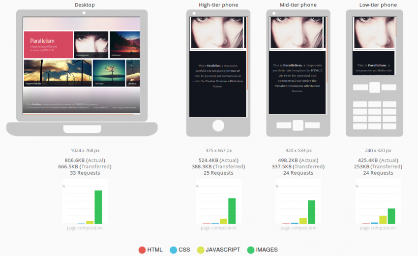
The following test report from our mobiReady tool (now discontinued) shows how the page weight has been reduced significantly across different mobile devices without impacting the site aesthetically. Note how the page size (actual and transferred) changes for each device.
For the web, native apps and mobile operator environments.
It is important to note that in these image resizing examples there is no negative impact to the site—the user will not be able to tell the difference between the "before" and "after" versions of the sites. The only difference is that pages will load significantly quicker on mobile devices, drain less battery and incur lower data costs. Numerous studies have shown that performance is critically important to site visitors. Lighter, faster pages also extend the global reach of your site by making them efficient enough to work over slower data links and a wider variety of mobile devices.
Thanks to the lighter page payload your NGINX server will be able to serve more traffic on a server with this resizing enabled, not less.
Conclusion
In this article we've shown how just a few lines of configuration can significantly improve the user experience of a site—without any changes to the application layer. The combination of NGINX's modular architecture combined with device intelligence added by DeviceAtlas enables powerful optimisations. In this example we tackled images but we need not stop there. Other device-specific optimisations are possible too e.g. altering page content to suit different device types or serving entirely different content to bots. Web traffic comes from diverse sources with differing needs—it makes little sense to serve exactly the same content to everyone when the capability to tailor it exists.
To try this solution yourself, head over to the download page to get started with the DeviceAtlas NGINX module.