


This article was originally published on mobiForge.com.
React and other JavaScript frameworks have frequently come under fire for not being suited to mobile. Hence mobile-first was a cornerstone of the Angular 2 rewrite. And despite React’s popularity, it still attracts the wrong kind of attention regarding mobile.
To my friends on the React team: you are on the hook until there's a disclaimer on your marketing/docs that says "only for use on desktop"
— Alex Russell (@slightlylate) February 22, 2017
How can server-side rendering help?
Since the JavaScript framework is responsible for orchestrating the page render, part of the problem is that a bunch of JavaScript needs to be downloaded and executed before a page can be generated, on top of the usual asset fetching and rendering tasks.
This can be problematic on mobile where mobile clients are on slow cell or “lie-fi” networks, or are running on old or slow hardware.
Enter server-side rendering (SSR). SSR can solve some of the same challenges that these frameworks face with mobile clients. Typically SSR works in these cases by executing the normally-run-on-the-client JavaScript on the server. It generates the HTML of the page, and sends it to the client so that there is very little work left for the client to do to get the page in front of the user’s eyes. A word of warning though, SSR is not a silver bullet for mobile performance, and adding SSR to your application will add considerable complexity to your codebase.
A common use case for server-side rendering is to take care of the initial render when a user first makes a request. When the server receives the request, it renders the required page components into an HTML string, and then sends that as a response to the client. After that, the client takes over rendering.
How can device detection help?
In the past, a criticism of adding device detection was that adding server-side code to a web project complicated things. However, if you’re going to the trouble of setting up SSR to optimise page loads for performance, it seems almost negligent not get the most out of your investment by optimising for the device too. You’ve already gone to the trouble of setting up a server-side solution, why not get everything you can out of it?
Server-side device detection works by using the User-Agent string to uniquely identify the client device type. By matching this against a database of device capabilities, relevant details about the user’s device can be known, and can be used to tailor an optimised response for that device.
So, why not try device detection alongside server-side rendering in a JavaScript framework? The simplest example I can think of to demonstrate this is a mobile vs desktop template switcher. We’ll use Vue.js in our example, if for no reason other than it’s got the best SSR documentation that I could find of any of the main JS frameworks, and it’s nice and easy to get basic SSR set up.
Simple server-side rendering with Vue.js
We’ll start off with Chris Fritz’s “Simplest possible Vue 2.0 SSR demo”.
First, let’s get this demo up and running, and take it from there. Grab the files from the git repository and run npm install to install the dependencies. Among other things, it should pull in the Vue framework and the Vue server side renderer packages.
You can check that everything is setup properly by running the server with:
1. npm run dev
Now browse to your local server, port 5000 at http://localhost:5000 and you should see something like:
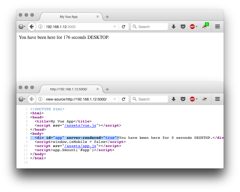
If you check the page source (View source), and compare with the DOM inspector in your dev tools, you should see something interesting. In the original source, you can see that the div with id="app" has an attribute server-rendered="true". Congrats! Server-side rendering with Vue is up and running.
In the dev tools Inspector, the server-rendered attribute is not present.
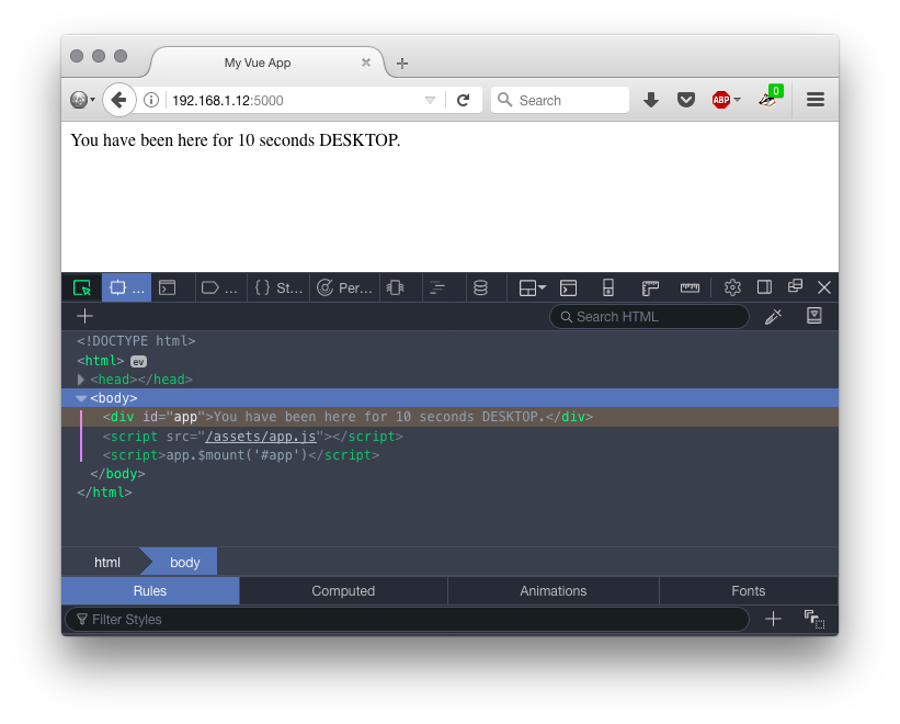
Let's see why. Our main index page looks like this.
Vue.js will replace the <div id="app"></div> with the server rendered code. After the initial render, the client side takes over and updates the DOM. That’s why when you inspect the DOM that it’s changed, and no longer has the server-rendered attribute.
To explore Vue SSR further, you can start with the Vue.js SSR documentation.
Adding server-side device detection with DeviceAtlas
So, next step for us is to get the DeviceAtlas node.js client up and running. You can grab the tarball from here: https://deviceatlas.com/resources/download-enterprise-api#nodejs. Then install it with npm install deviceatlas-deviceapi-2.1.0.tgz
We can now import and set up DeviceAtlas in our application with the following code:
1.  var DeviceApiWeb = require('deviceatlas-deviceapi').DeviceApiWeb;
2.  var deviceApi = new DeviceApiWeb();
Next we need to load the DeviceAtlas data file—this contains the device data. It’s what DeviceAtlas uses to determine the capabilities of the user agent. You need to download this file separately here.
1.  try {
2.     deviceApi.loadDataFromFile('47722_20170307.json');
3.  } catch(e) {
4.      //json could not load! do something!
5.      console.log('couldnt load data');
6.  }
Next we want to pass the request object to DeviceAtlas so that it will examine the User-Agent string in the request, and provide the properties of the device. For our simple example, we’re only interested in the mobileDevice property, and we’ll deliver a different Vue template based on its value. You can see the full range of properties on the DeviceAtlas site. Available properties include things like screen width and height which are useful for optimising images, isTouchscreen, which is useful for optimising tap targets and so on.
So, let's check if it's a mobile device. Easy!
1. var properties = deviceApi.getPropertiesFromRequest(request);
2. var isMobile = properties.contains('mobileDevice', true);
We add this DeviceAtlas code to our server.js file. Express.js is used for routing. We'll add the device detection code we just saw to the Express routing code, so it now looks like this, with the new code bolded:
1. server.get('*', function (request, response) {
2.  // Render our Vue app to a string
3.   var DeviceApiWeb = require('./deviceatlas-deviceapi').DeviceApiWeb;
4.   /* Create an instance of DeviceApiWeb with default config */
5.   var deviceApi = new DeviceApiWeb();
6.   /* Load data. */
7.   try {
8.       deviceApi.loadDataFromFile('./26732_20170308.json');
9.   } catch(e) {
10.       //json could not load! do something!
11.      console.log('couldn\'t load DA data');
12.   }
13.   var properties = deviceApi.getPropertiesFromRequest(request);
14.   var isMobile = properties.contains('mobileDevice', true);
15.
16.   renderer.renderToString(
17.     // Create an app instance
18.     require('./assets/app')(isMobile),
19.     // Handle the rendered result
20.     function (error, html) {
21.       // If an error occurred while rendering...
22.       if (error) {
23.         // Log the error in the console
24.        console.error(error)
25.         // Tell the client something went wrong
26.         return response
27.           .status(500)
28.           .send('Server Error')
29.       }
30.       // Send the layout with the rendered app's HTML
31.       response.send(
32.         layout.replace('', html)
33.        )
34.     }
35.   )
36. })
Next we need to choose the correct template for Vue to use, and we have to make sure that when the rendering is passed to the client for future requests, that the same template is used.
This can be achieved in a couple of different ways.
Alternative templates based on device type
Our SSR example setup started off with /assets/app.js returning a single template, with this code:
(function () { 'use strict'
1.  var createApp = function () {
2.    // ---------------------
3.    // BEGIN NORMAL APP CODE
4.    // ---------------------
5.
6.    // Main Vue instance must be returned and have a root
7.    // node with the id "app", so that the client-side
8.    // version can take over once it loads.
9.    return new Vue({
10.      template: 'You have been here for {{ counter }} seconds.',
11.      data: {
12.        counter: 0
13.     },
14.      created: function () {
15.        var vm = this
16.        setInterval(function () {
17.         vm.counter += 1
18.        }, 1000)
19.      }
20.    })
21.
22.    // -------------------
23.    // END NORMAL APP CODE
24.    // -------------------
25.  }
26.  if (typeof module !== 'undefined' && module.exports) {
27.    module.exports = createApp
28.  } else {
29.    this.app = createApp()
30.  }
31. }).call(this)
To support device switching, we’ll modify this code so that there are two templates that it can return: one for desktop, one for mobile:
1.  var desktopPage = {
2.        template: 'You have been here for {{ counter }} seconds DESKTOP.',
3.        data: {
4.          counter: 0
5.        },
6.        created: function () {
7.          var vm = this
8.          setInterval(function () {
9.            vm.counter += 1
10.          }, 1000)
11.        }
12.      }
13.
14.  var mobilePage = {
15.    template: 'You have been here for {{ counter }} seconds MOBILE.',
16.    data: {
17.      counter: 0
18.    },
19.    created: function () {
20.      var vm = this
21.      setInterval(function () {
22.        vm.counter += 1
23.      }, 1000)
24.    }
25.  }
We’re just changing some text between the two templates, but in a real application you might send quite different components to the mobile and desktop user agents as appropriate.
So how do we trigger which template is chosen? We need to pass in the isMobile variable from our server.js file, and then use this to choose the correct template.
We can achieve this by replacing the line:
1. require('./assets/app')(),
with
1. require('./assets/app')(isMobile),
Now we can decide which template to return, in app.js:
1.  var createApp = function (isMobile) {
2.    return new Vue(isMobile ? mobilePage : desktopPage)
3.  }
4.
5.  if (typeof module !== 'undefined' && module.exports) {
6.    module.exports = createApp
7.   } else {
8.    this.app = createApp(this.isMobile)
9.   }
10.  }).call(this)
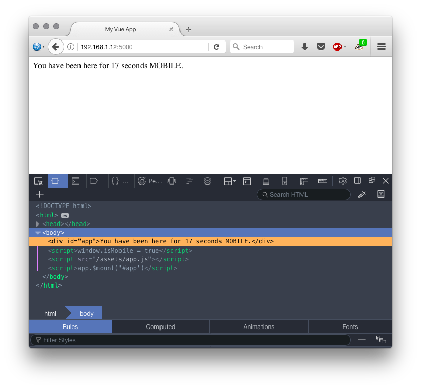
If you reload the app, you’ll now see that the server is correctly displaying the mobile template for mobile user agents. But after this, the client takes over, and the server-side detection is not available on the client, so it will always default to the desktop template after the initial render.
We can fix this, by passing the device type to the client side application at the same time that the Vue template is written to the DOM. So we add an isMobile property to our index.html app shell:
And we can modify this value when we render the app in server.js:
1.    response.send(
2.      layout.replace('', html).replace('window.isMobile = false', 'window.isMobile = ' + isMobile)
3.      )
Reload and everything should be working as expected, both client and server render the correct template for the user agent. (Full code can be downloaded at end of article).
Routing based on device type
The example so far has only distinguished between mobile and non-mobile user agents, and it was based on returning an appropriate template, desktop or mobile, from app.js. This is a nice solution, and it all runs off a single URL.
But this is not our only option. In the following example, we’ll show how to achieve finer grained device detection, and how you can segment your traffic based on device using Express routing. Such fine-grained device segmentation is the basis of adaptive web design, a technique that 80% of the Alexa top 100 sites are applying.
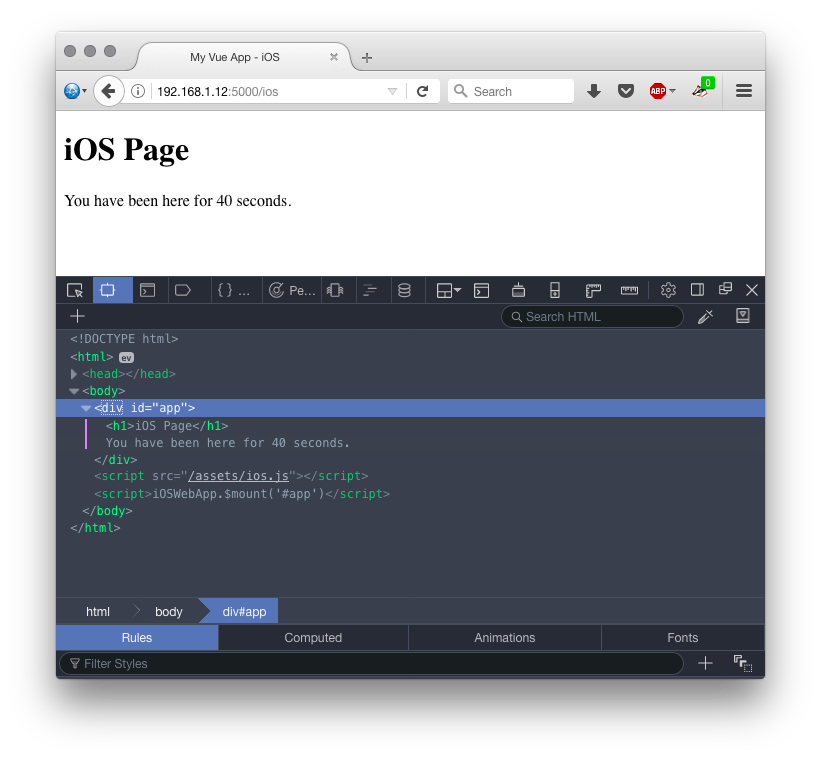
For this example, we’ll redirect iOS user agents to a separate page at /ios. Note that we are not saying that this is necessarily the right thing to do, but it’s intended to show that there are multiple ways you can achieve traffic segmentation based on device.
We’ll pick up where we left off and add this extra functionality to the last example.
First, in our server.js file, we read in the HTML layout for iOS devices:
1. var layoutiOS = fs.readFileSync('./ios/index.html', 'utf8')
Next we set up a new route that we’ll use for iOS devices:
1.  server.get('/ios', function (request, response) {
2.    renderer.renderToString(
3.    // Create an app instance
4.    require('./assets/ios')(),
5.    // Handle the rendered result
6.    function (error, html) {
7.      // If an error occurred while rendering...
8.      if (error) {
9.        // Log the error in the console
10.        console.error(error)
11.       // Tell the client something went wrong
12.        return response
13.          .status(500)
14.          .send('Server Error')
15.      }
16.      // Send the layout with the rendered app's HTML
17.      response.send(
18.        layoutiOS.replace('', html)
19.        )
20.     }
21.   )
22. })
We update our device detection code to handle the iOS case:
1.      var isiOs = properties.contains('osiOs', true);
2.      if (isiOs) {
3.        response.redirect('/ios');
4.        return;
5.      }
That’s all the changes we need for the server.
Now, we create the iOS directory and add the HTML page. It’s more or less the same as our previous HTML, with small iOS-specific differences highlighted below:
Finally, we also have to create an iOS-specifc app file. Once again, it’s very similar to what we’ve seen already:
1. (function () { 'use strict'
2.  var iOSPage = {
3.    template: 'iOS Page You have been here for {{ counter }} seconds.',
4.    data: {
5.      counter: 0
6.    },
7.    created: function () {
8.      var vm = this
9.      setInterval(function () {
10.        vm.counter += 1
11.      }, 1000)
12.    }
13.  }
14.
15.  var createApp = function () {
16.   return new Vue(iOSPage)
17.  }
18.  if (typeof module !== 'undefined' && module.exports) {
19.    module.exports = createApp
20.  } else {
21.    this.iOSWebApp = createApp()
22.   }
23.  }).call(this)
And that’s it. Restart your server, and if you visit on a number of different user agents (the Firefox User-Agent switcher add-on is good for this), you should see:
- Desktop UA -> desktop template as before
- Mobile (non-iOS) UA -> mobile template as before
- iOS UA -> new iOS template
Closing remarks
In this article we explored approaches to implementing mobile optimisation based on device detection, combined with server-side rendering in a JavaScript framework. Server-side device detection has sometimes been criticised because server-side code is harder to implement than pure client side feature detection. The drive behind this article was that if you’re already going to the trouble to implement server-side rendering, why not optimise for mobile devices while you’re at it too? You’ve already gone to the trouble of adding server component to your app, why not squeeze as much as you can out of it?
The examples here were developed as a proof-of-concept and are likely not optimal. Vue.js was chosen for the examples because it seemed to offer the easiest way to get server-side rendering up and running. No doubt there is a more efficient way to achieve the goals here.
Many thanks to Hasnat Ullah (@hasnatullah) for helping with the Vue.js side of the examples when I got stuck
Download: vue-ssr-device-detection.zip