

Have you used Google’s Mobile-Friendly Test tool? If yes, you should know that this tool does not analyse every aspect of the website and therefore the test result is less important than you might think. Even if your website scored ‘Awesome!’ in the test some optimization might be required.
The mobile-friendly SEO apocalypse
Google introduced the mobile-friendly SEO changes on 21 April 2015. Websites failing to adhere to Google’s standards for mobile started to lose mobile search-driven traffic. This ‘mobile apocalypse’ compelled website owners to look for reliable ways to test if their websites were mobile friendly.
One of the tools that Google recommends is its own Mobile-Friendly Test. To use it, you just enter a URL and then the tool analyses it and reports if the page has a mobile-friendly design. For many people this meant that once the website passed the test, there was no need to optimize it any more.
However, we have recently revealed that this test only examines if the website fits the screen’s width. And nothing else.
How does a 100MB website score?
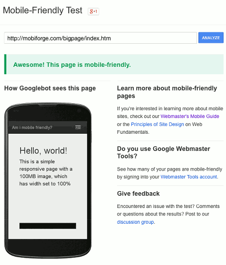
Over on mobiForge our sister site for mobile developers, Ruadhan O’Donoghue (@rodono) investigated Google’s tool by testing a website that is extremely heavy and slow to load. Certainly NOT mobile-friendly.
“I wanted to verify Google's Mobile-Friendly Test, and determine whether it was good enough for Google just to be responsive, without worrying about being mobile-friendly.”
For this purpose Ruadhan built a simple responsive website that had just one component: a 100MB image.
The 100MB website didn’t score ‘mobile-friendly’ when the image’s width was not set to percentage. This made sense given that the 100MB image was 24,000px wide.
However, when a width="100%" parameter was applied to the img element, it was well enough for the Google’s tool to say: Awesome! This page is mobile-friendly!
Going responsive is not enough to be mobile-friendly
Google's Mobile-Friendly test tool only checks the website’s width which can be misleading for users who don't know any better tool. This means that every responsive website scores ‘Awesome.’ The problem is that it doesn't communicate what the result means by saying, for instance, "the website looks visually mobile-friendly, but it's never going to load, and you’ve got more work to do."
There's a lot more to mobile-friendliness than just being responsive and/or fitting the screen’s width, such as page weight, loading speed, and mobile user experience. Google certainly takes these aspects into consideration when it comes to mobile search rankings. Here you can learn more about Google’s mobile-friendly guidelines.