

One of the key metrics businesses should be constantly monitoring is conversion rates on their website. It's great if you are getting tons of traffic but that is only half the battle; turning those visitors into conversions is where the real work begins and is by far the biggest indicator of how well your website is driving business.
There's a lot of work that needs to be done behind the scenes when it comes to optimizing your conversion rate. To generate leads for your sales teams, you need to have a website that is not only easy on the eye but also one that performs in terms of usability. One of the ways to ensure this is adopting a One Web approach.
The business case for adaptive web design
You may be thinking that this all sounds great but how does one start adopting a One Web approach? Well, currently there are 2 techniques for doing this:
- Responsive Web Design (RWD)
- Adaptive Web Design (AWD)
Responsive design involves serving the same HTML content to every device which is then automatically rearranged based on the user’s device. While this is a good approach for providing users with a better mobile experience, loading times can be a problem as the same assets are often sent to all users regardless of device.
This can greatly affect web performance which Mobify found to be the case in their analysis of 15 e-commerce sites. Their results showed that the home page of each site loaded an average of 87 resources and 1.9MB of data. Because the right content isn’t always served to the right device, conversion rates can drop.
Adaptive design on the other hand, adjusts its assets based on the user’s device. This means the user only receives content that can be displayed on their specific device, meaning the content that is displayed is served quicker to the user. This greatly increases the reach and performance of your website as it is made easily accessible to all devices.
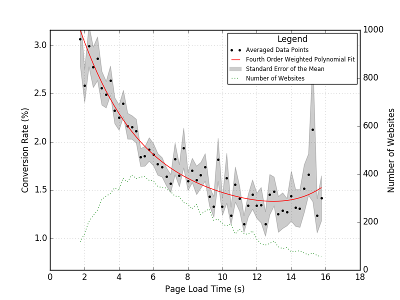
This is a critical point for businesses. According to research from Compass, conversions fall by 12% for every second it takes your page to load. To put it another way: if your business is making $100,000 on your site every day, an improvement of just 1 second in page speed could mean an increase in revenue of $4.3 million every year.
Put simply, your website’s speed and performance impacts your bottom line, which has not gone unnoticed by the biggest brands in the world. 82% of the Alexa 100 top sites use adaptive design to serve content on their main website entry point.
How adaptive design contributes to improved conversion rates
With device fragmentation on the rise, the key challenge for businesses is to ensure their websites cater to a wider range of devices which will go a long way to improving conversion rates and subsequently ROI. Here are the key ways in which adaptive design can help you do this:
1. A wider reach
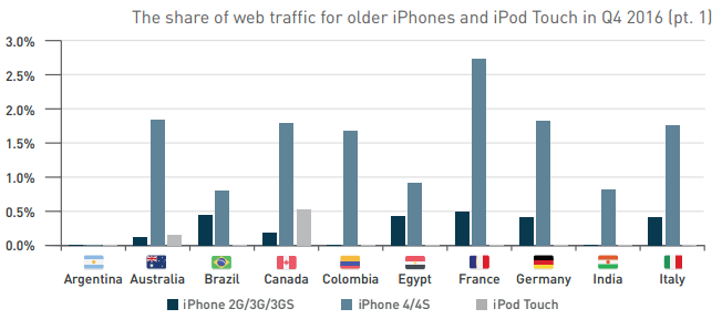
By employing adaptive web design principles, you can deliver the appropriate experience to each user’s device. This helps you serve a much wider audience, some of which may not be using the latest cutting edge devices or high-speed networks. In fact, our latest quarterly report revealed that older versions of the iPhone such as iPhone 2G/3G/3GS and iPhone 4/4S are still actively used today.
By taking account of users with lower end devices, you are effectively maximizing the reach of your website. This means more traffic and visits which is the first step to increasing your conversions.
2. Faster page loads
We already touched on this in the previous section but it’s worth emphasizing again. By using adaptive design, assets are only served if they are necessary for a specific device. For example, high-resolution graphics will be transferred only when a high-density screen is detected.
The ever-shrinking attention span of users makes it paramount for businesses to serve content more efficiently and faster, and the reduced page weights and faster load times powered by adaptive design will lead to improved conversion rates.
3. Tailored user experiences
The customer journey is now a multi-device path to purchase with users researching, evaluating and purchasing products and services across different devices. This puts the onus on businesses to create websites that reflect the needs of a user and provide a streamlined path to conversion based on their device.
According to Google, 70% of users will more than likely buy a site’s product or service if the site is mobile-friendly. Adaptive web design allows you create intuitive designs and serve content and page layouts that look great on a user’s device, helping you build a strong device-based user experience which ultimately improves your conversion rates. Check out these 8 methods to boost your conversion rate on mobile.
Whether it’s getting information from visitors such as their email or increasing sales on your website, conversion rates are an important metric for businesses. To give you the best chance of success, website performance needs to take center stage. By using adaptive design, you can improve page load times and deliver personalized experiences in a scalable way.