



The most common browser viewport in mobile web traffic is still about 360 pixels wide, the same as it was a decade ago. The phones behind it have changed completely. The Galaxy J5 that reported 360 CSS pixels in 2016 had a 720×1280 screen; the Galaxy S24 reporting it today has 1080×2340, nearly three times as many pixels on a taller, denser panel.
The layout box barely moved while everything behind it grew.
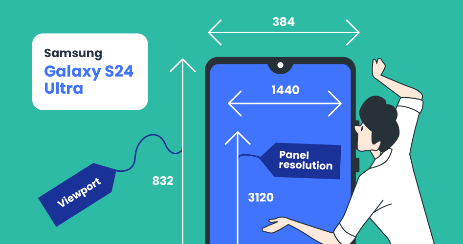
That gap between what a phone renders and what a browser lays out inspired this article. A device with a 1440×3120 panel does not give your CSS a 1440-pixel canvas. It gives you about 384, and most of the time it isn't even driving the full panel: the usual setup renders at 1080, which the device pixel ratio then maps down to a 384-pixel layout. Get that relationship wrong and your layout breaks, your images ship at the wrong size, and your Core Web Vitals suffer for pixels nobody can see.
Every figure in this article comes from a large, anonymized sample of real-world traffic seen by DeviceAtlas services in May 2026. Vendor popularity is weighted by each vendor's share of requests to those services, while every viewport and per-model figure is read from the client-side component, which reports the browser's real CSS viewport. First, the four numbers and how they fit together.
Contents
- Viewport vs resolution vs DPI vs DPR
- What HD+, FHD+ and QHD+ mean
- The most popular smartphones in web traffic
- Apple iPhone · Samsung · Xiaomi and Redmi · Motorola · Google
- The viewport sizes that actually reach you · One device, several viewports
- How smartphone screens have changed
- Foldables have two viewports, not one
- The viewport meta tag
- What viewport size should you design for?
- Why detecting screen properties matters
- Frequently asked questions
Viewport vs resolution vs DPI vs DPR
There are four terms that get used interchangeably which shouldn't, as they describe different things:
- Resolution is the pixel grid of the panel, e.g. 1080×2400, 1440×3120. The panel is fixed in hardware, but the resolution a phone actually renders at can be a software setting. Many QHD Android flagships ship rendering at FHD+ (1080), not their full QHD (1440) panel, so the resolution in play is not always the one on the spec sheet.
- Diagonal screen size is the physical measurement across the panel in inches. A 6.1-inch phone and a 6.9-inch phone can share the same resolution.
- DPI (dots per inch, sometimes PPI) is pixel density: resolution spread over that diagonal. A small, high-resolution screen has a high DPI. Recent iPhones sit around 458. Budget phones with HD+ panels sit closer to 260.
- DPR (device pixel ratio) is the bridge to the browser. It is the number of physical pixels the device maps to one CSS pixel. Most modern flagships report a DPR near 3, which is why their layout viewport is so much smaller than their resolution suggests.
The relationship that ties them together:
CSS viewport width ≈ physical resolution width(*) ÷ device pixel ratio
An iPhone 16 has a 1179×2556 panel and a DPR of 3. At its default Display Zoom, divide and you get a 393×852 CSS viewport, which is exactly the width your media queries respond to. The phone has 1179 physical pixels across; your stylesheet sees 393. That factor of three is also why a single CSS pixel is drawn with nine physical pixels, and why a 1× image looks soft on it.
(*) That clean division is only accurate when the resolution the device renders at is the panel resolution, and both platforms let the user change that. On an iPhone, the Display Zoom setting (Default or Larger Text) re-renders the screen at a coarser resolution: switch the iPhone 16 to Larger Text and its viewport drops from 393 to 320. On a Galaxy S24 Ultra, the panel is 1440 wide but the phone renders at 1080 by default, so dividing the full 1440 by a DPR of 3 gives 480, a width the device never actually presents; its real default viewport is 384, from 1080 ÷ 2.8125. That is exactly why the real viewport comes from the browser, not from a manufacturer's spec sheet, and it is the through-line of the rest of this article.
So when someone asks "what size should I design for?" the answer is the viewport, not the resolution. The resolution tells you how sharp your assets need to be. The viewport tells you how much room you have to lay things out. One thing to remember: a CSS pixel is not a hardware pixel. It is the reference pixel, defined as roughly 1/96th of an inch, and the device pixel ratio is simply how many physical pixels the browser paints into each one.
What HD+, FHD+ and QHD+ mean
Phone resolutions are sold as short labels, and they all describe one thing: how many pixels run across the short edge of the screen. The "+" on the end means the panel is tall, roughly 20:9, rather than the old 16:9 shape, so the names stretched to fit.
| Label | Typical resolution | Pixels across | Where it shows up |
|---|---|---|---|
| HD+ | 720×1600 | 720 | budget phones |
| FHD+ (Full HD+) | 1080×2400 | 1080 | the mainstream standard |
| 1.5K | 1220×2712 | 1220 | premium Android (Xiaomi, OnePlus, Motorola Edge) |
| QHD+ (WQHD+) | 1440×3120 | 1440 | top flagships (Samsung S Ultra) |
The plain versions without the "+" are the older 16:9 forms still quoted now and then: HD is 720×1280, Full HD 1080×1920, QHD 1440×2560. (4K is a TV and monitor term; phones stop at QHD+.)
The label doesn't tell you how much room your layout gets. A QHD+ phone has more pixels than an FHD+ one, but both present a similar CSS viewport, because the extra resolution is absorbed by a higher device pixel ratio. You get a sharper screen, not a larger one, which is why a Galaxy S Ultra at QHD+ and a mid-range phone at FHD+ are both about 384–393 CSS pixels wide.
The most popular smartphones in web traffic
Ranked by each vendor's share of smartphone requests in May 2026:
| Vendor | Share of phone traffic |
|---|---|
| Apple | 30.2% |
| Samsung | 25.3% |
| Xiaomi (incl. Redmi, Poco) | 9.6% |
| Motorola | 6.0% |
| Oppo | 3.7% |
| 2.7% |
Apple and Samsung together are more than half of all smartphone traffic. The tables below list the most-requested models per vendor with their server-side DeviceAtlas screen properties. The Viewport column is the most common CSS viewport each model reports in real traffic — the browser-measured default, not a figure calculated from the spec sheet — so QHD flagships show the width a browser actually presents rather than a naive resolution-over-DPR value. Per-model device pixel ratio is left out of the tables on purpose; it is the one stored value that is unreliable on some devices, and its longer-run trend is in the evolution section.
Apple iPhone
Apple is the single largest vendor in traffic, but iOS User-Agents carry no model name, so you cannot read an iPhone's screen from its User-Agent. What you can read is the viewport the browser reports through the client-side component. Here is the real distribution across iPhone traffic, with the models behind each size:
| Viewport (CSS px) | Share of iPhone traffic | Models |
|---|---|---|
| 390×844 | 18.9% | iPhone 12 / 13 / 14 / 16e (6.1") |
| 414×896 | 16.3% | iPhone XR / 11 / XS Max / 11 Pro Max |
| 393×852 | 11.9% | iPhone 14 Pro / 15 / 16 |
| 375×812 | 9.3% | iPhone X / XS / 11 Pro / 12–13 mini |
| 430×932 | 8.4% | iPhone 14–16 Plus and Pro Max |
| 402×874 | 6.4% | iPhone 16 Pro |
| 440×956 | 6.2% | iPhone 16 Pro Max / 17 Pro Max |
| 375×667 | 5.8% | iPhone SE / 6 / 7 / 8 (4.7") |
Just over half of iPhone traffic sits in the 390–414 band. The DPR is 3 on 82% of iPhone traffic (every recent model) and 2 on the older LCD models — the 4.7-inch SE line and the 6.1-inch XR and 11 — so a 390-wide viewport is backed by a 1170-wide panel. These are the widths each model reports at its default Display Zoom, where most traffic sits; switching an iPhone to Larger Text narrows it (see One device, several viewports). These shares come from 3.2 million iPhone sample records seen across May 2026.
Samsung
Samsung spans the widest range in traffic, from sub-$150 Galaxy A handsets on HD+ panels to QHD+ flagships.
| Model | Viewport | Panel resolution | Diagonal | DPI |
|---|---|---|---|---|
| Galaxy S24 Ultra | 384×832 | 1440×3120 | 6.8" | 505 |
| Galaxy S25 Ultra | 384×832 | 1440×3120 | 6.9" | 498 |
| Galaxy S24 | 360×780 | 1080×2340 | 6.2" | 416 |
| Galaxy S22 Ultra 5G | 384×824 | 1440×3088 | 6.8" | 500 |
| Galaxy A54 | 384×832 | 1080×2340 | 6.4" | 403 |
| Galaxy A12 | 385×854 | 720×1600 | 6.5" | 270 |
The QHD Ultra models carry a 1440-wide panel but ship at FHD+ by default, so the viewport a browser actually reports on them is about 384, not the 480 you would get by dividing the full panel by three. Within Samsung the default viewport is not uniform: the base Galaxy S line reports 360 wide, while the A-series and the Ultra models report 384. The difference is the display-density setting each model ships with, not the panel.
The same model often reports several different widths as a user changes that setting — One device, several viewports breaks down how a single Galaxy lands on five.
Xiaomi and Redmi
Xiaomi's traffic splits between the Redmi/Poco volume lines and the Xiaomi-branded flagships. Note the honest DPR values here: 2.75 on the 1080-wide models, for a 393-wide viewport.
| Model | Viewport | Panel resolution | Diagonal | DPI |
|---|---|---|---|---|
| Redmi Note 9 | 393×851 | 1080×2340 | 6.53" | 395 |
| Redmi Note 13 4G | 393×873 | 1080×2400 | 6.67" | 395 |
| Xiaomi Mi 11i | 393×873 | 1080×2400 | 6.67" | 395 |
| Poco X6 Pro 5G | 407×905 | 1220×2712 | 6.67" | 446 |
| Xiaomi 14T | 407×905 | 1220×2712 | 6.67" | 446 |
| Redmi 14C | 360×820 | 720×1640 | 6.88" | 260 |
Motorola
Motorola's traffic is almost entirely the budget Moto G line, and it breaks the pattern set by Samsung and Pixel. Motorola ships a lower display density, so its phones report unusually wide viewports: the HD+ Moto G models sit at a device pixel ratio near 1.75, which lands the viewport around 412, wider than most flagships, and the FHD+ Stylus and Power models go wider still, to 432–444. These are among the widest high-volume viewports in all of mobile traffic, which is the opposite of what their budget positioning suggests.
| Model | Viewport | Panel resolution | Diagonal | DPI |
|---|---|---|---|---|
| Moto G (2025) | 412×917 | 720×1604 | 6.7" | 262 |
| Moto G 5G (2024) | 412×922 | 720×1612 | 6.6" | 267 |
| Moto G Play (2024) | 412×915 | 720×1600 | 6.5" | 270 |
| Moto G Stylus 5G (2024) | 432×960 | 1080×2400 | 6.7" | 393 |
| Moto G Power (2025) | 444×980 | 1080×2388 | 6.8" | 385 |
Pixels run high pixel densities, and their FHD+ models report a DPR near 2.6, which puts their viewport around 412 rather than the 360 a flat division would suggest. That is the same ~412 width as Motorola's budget Moto G line, reached from the opposite direction — high density on a 1080 panel instead of low density on a 720 one. The Pro models step up to QHD and a 448 viewport, the widest in any of these tables.
| Model | Viewport | Panel resolution | Diagonal | DPI |
|---|---|---|---|---|
| Pixel 8 | 412×915 | 1080×2400 | 6.2" | 424 |
| Pixel 9 | 412×924 | 1080×2424 | 6.3" | 422 |
| Pixel 9a | 412×924 | 1080×2424 | 6.3" | 421 |
| Pixel 8 Pro | 448×998 | 1344×2992 | 6.7" | 490 |
| Pixel 9 Pro XL | 448×998 | 1344×2992 | 6.8" | 482 |
Oppo, vivo and realme
These three are heavily weighted toward budget and lower-mid-range handsets in traffic: mostly 720-wide HD+ panels at DPR 2, with FHD+ on the step-up models.
| Model | Viewport | Panel resolution | Diagonal | DPI |
|---|---|---|---|---|
| Oppo Reno7 Pro 5G | 393×873 | 1080×2400 | 6.55" | 402 |
| Oppo A38 | 360×806 | 720×1612 | 6.56" | 269 |
| vivo Y36 | 393×869 | 1080×2388 | 6.64" | 395 |
| vivo Y19s | 360×804 | 720×1608 | 6.68" | 264 |
| realme C67 | 393×873 | 1080×2400 | 6.72" | 392 |
| realme Note 50 | 360×800 | 720×1600 | 6.7" | 262 |
The viewport sizes that actually reach you
The viewport is the number you design against, and the most reliable way to read it is from the browser itself. DeviceAtlas's client-side component reports the real CSS viewport, which matters because some devices store a rounded device pixel ratio that makes a naive resolution-over-DPR calculation too wide. The figures below come from 20.4 million sample records seen across May 2026: real screen.width and devicePixelRatio values reported by the browser, not derived from a spec sheet.
Drawn to scale and stacked on a common center, the everyday viewports are closer together than the spec sheets suggest:
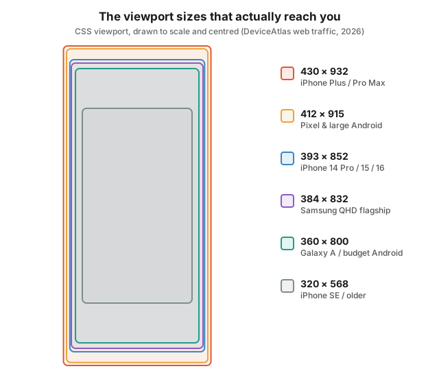
Here are the most common mobile viewport widths: every height merged into the width it shares, because width, not height, is what your breakpoints key off:
| Viewport width | Share of mobile | Typical devices |
|---|---|---|
| 360 px | 18.2% | Samsung base Galaxy S line, budget Android |
| 384 px | 17.4% | Samsung Ultra and A-series (FHD+ default) |
| 412 px | 17.1% | Pixel, large Android, Motorola |
| 320 px | 7.0% | modern phones at largest display or Display Zoom, accessibility zoom, plus older small iPhones |
| 390 px | 3.7% | iPhone 12–16 base class |
| 393 px | 3.5% | iPhone 14 Pro / 15 / 16, Android flagships |
| 414 px | 3.3% | iPhone XR / 11 class, large Android |
| 375 px | 3.3% | iPhone X / XS / 11 Pro / mini |
Three widths do most of the work: 360, 384 and 412 px each take roughly a sixth of mobile traffic, and together just over half. The surprise is 320 px in fourth place, not old iPhones but modern flagships, an Android turned up to its largest display or an iPhone switched to Larger Text, which makes 320 a live floor your layout still has to survive, not a legacy width you can drop. After that it is a long tail, which is why a fixed device list fails where a width-based approach works.
By width, mobile traffic falls into roughly four bands: about 31% at 360 px or narrower (Samsung's base line, budget Android, and phones at their largest display zoom), another 34% from 361 to 393 (the iPhone 390/393 class plus Samsung's 384 flagships), 19% from 394 to 412 (Pixels and large Android), and 17% above 412 (the Plus and Pro Max phones at 430–440, plus Motorola's wide budget line). Three or four breakpoints cover almost everything.
One device, several viewports
A spec sheet gives a phone one viewport. Real traffic gives it several, and this is true on both platforms. The user can change the resolution the screen renders at, which changes the CSS-pixel-to-physical-pixel mapping while the panel stays the same. On Android it is the display-size and screen-resolution settings; on iOS it is Display Zoom. The same Galaxy S24 Ultra reports five common viewports across our records.
Galaxy S24 Ultra viewports reported across its traffic:
| Viewport reported | DPR | Resolution settings | Display size | Share of traffic |
|---|---|---|---|---|
| 384×832 | 2.8125 | FHD+ (1080) | default | 36% |
| 412×892 | 2.625 | FHD+ (1080) | smaller | 20% |
| 360×780 | 3 | FHD+ (1080) | larger | 14% |
| 385×833 | 3.75 | WQHD+ (1440) | default | 6% |
| 320×694 | 3.375 | FHD+ (1080) | largest | 6% |
These are two independent settings, not one slider: screen resolution sets how many pixels the panel renders (1080 by default, 1440 at full WQHD+), and display size sets the zoom level. Every row reconciles to its render width — 384 × 2.8125, 412 × 2.625 and 360 × 3 all land on 1080, while 385 × 3.75 is the minority who switched the panel to its full 1440 at the default display size.
iPhones do the same thing, just with one control instead of two. Display Zoom (Settings → Display & Brightness → Display Zoom: Default or Larger Text) re-renders the screen at a coarser resolution, which narrows the viewport. The setting dates back to the iPhone 6 and 6 Plus in 2014, and on a modern iPhone it still moves the width by a full size class:
iPhone viewport width by Display Zoom (portrait):
| Model | Default | Larger Text |
|---|---|---|
| iPhone 16 | 393 | 320 |
| iPhone 17 Pro Max | 440 | 375 |
| iPhone SE (3rd gen) | 375 | 320 |
So an iPhone 16 set to Larger Text reports the same 320-wide viewport as a small SE. A modern flagship lands on the oldest, narrowest width class purely from a settings change. Display Zoom sets the width; the height moves separately with the address-bar position, the system text size and orientation. (iPhone figures verified on iOS 26 from physical devices and the iOS simulator; they shift on older iOS versions and in non-Safari browsers.)
Underneath, both platforms obey the same rule with opposite defaults: a phone renders at its native panel resolution unless that panel is high-res enough (QHD and up) to ship downscaled for battery life. So an iPhone defaults to full resolution and lets you opt down to a larger interface, while a QHD Samsung defaults to a reduced resolution and lets you opt up to the full panel — opposite directions, same result the spec sheet can't predict.
The lesson for layout is that a device's viewport is a small distribution, not a constant, on every platform. Design to the band a model occupies, not to one number, and never assume the panel resolution divided by a whole-number DPR gives the viewport. It usually does not.
What the viewport width leaves out
Two caveats stop a width from being the whole story. Not all of it is usable: the notch, Dynamic Island, rounded corners and the home indicator carve rows out of that 390×844 box, so edge-to-edge layouts need viewport-fit=cover and the env(safe-area-inset-*) values to keep content clear of the cutouts. And the height is not fixed; mobile browsers grow and shrink their toolbars as you scroll, which is why 100vh overflows the screen on load. Reach for the dynamic viewport units instead: dvh, with svh and lvh for the small and large states.
How smartphone screens have changed
DeviceAtlas has tracked the most-used screen resolution and viewport from real web traffic for a decade. Stitching those published figures to today gives a genuine before-and-after.
| Year | Most-used resolution (web traffic) | Most-used viewport | Typical DPR |
|---|---|---|---|
| 2016 | 720×1280 rising, 1080×1920 at the high end | 360×640 (Android), 375×667 (iPhone) | 2 |
| 2017 | 720×1280, then 750×1334 and 1080×1920 | 360×640 worldwide, then 375×667 | 2 |
| 2019 | 1080×1920, with 1440×2960 climbing | 360-class | 2.6–3 |
| 2026 | 1080×2400 (FHD+) | 360–412 (Android), up to 444 on low-density budget phones; 390×844 (iPhone) | 1.75–3 |
The device pixel ratio is the hidden factor here. It roughly doubled from 2 in the 720p era to around 3 once 1080-class panels arrived, and that is why the viewport barely moved while resolution climbed: each jump in physical pixels was absorbed by a higher DPR rather than a wider layout. It has sat near 3 on most phones ever since, though it spreads wider than a single number suggests: about 1.75 on low-density budget lines like Motorola, up to 3.75 when a QHD panel is switched to its full resolution.
Resolution stepped up once and then stopped: 720×1280, to 1080×1920, to today's 1080×2400, with the jump to Full HD+ happening around 2018–2020 and nothing newer displacing it since, because there is no visible benefit at this screen size. Aspect ratio went tall in the same window, from 16:9 panels to the roughly 20:9 shape that is now standard.
The viewport tells the more useful story. CSS width has barely moved in ten years: most phones still report between 360 and 412 px, against resolutions that more than doubled. Phones got taller, not wider: 360×640 became 360×780, and the iPhone class crept from 375×667 to 390×844. A layout built to a 360-wide target in 2016 still fits a 2026 phone. It simply has more vertical room now.
Foldables have two viewports, not one
Foldables are still a small share of traffic, but a fast-growing one, and they retire the old "mobile, tablet, desktop" triad. A book-style foldable has two viewports: a narrow cover screen and a near-square inner one. The Galaxy Z Fold7 reports about 412×960 folded and 750×832 unfolded; the Pixel 9 Pro Fold about 444×995 and 755×783. Those near-square inner viewports come off much larger panels (1968×2184 and 2076×2152), the panel-versus-viewport gap once more.
The device switches between the two mid-session when the user unfolds it, so a layout that only ever saw the cover screen reflows awkwardly the moment it opens. Treat the fold as a state change, not a fixed size, and use the CSS Viewport Segments API with the env(viewport-segment-*) variables to detect the hinge and keep important controls out of the crease. As of 2026 that API is Chromium-only (Chrome and Edge, not yet Safari or Firefox), so treat it as progressive enhancement and make sure the layout still holds up without it.
This is also why "biggest phone screen" now means a foldable: ordinary phones have stalled at 6.9 inches (Galaxy S25 Ultra, iPhone 17 Pro Max) while unfolded foldables reach eight.
The viewport meta tag
None of the widths above apply unless the page opts in. Without the viewport meta tag, a mobile browser assumes a desktop-width canvas (around 980 px) and shrinks the whole page to fit, so your media queries never become active. One line in the <head> fixes it:
<meta name="viewport" content="width=device-width, initial-scale=1">
That sets the layout viewport to the device width and the initial zoom to 1. Resist the urge to add user-scalable=no or maximum-scale=1: disabling zoom locks out anyone who needs to pinch in to read, and counts as an accessibility failure under WCAG.
What viewport size should you design for?
If you take one thing from this article: design for two viewports, 360 px wide for Android and 390 × 844 for Apple. Build to 360 first, the narrowest of the common default widths, so anything that fits 360 also fits the iPhone at 390 and the wider Pixels at 412. Then check 320, where phones on accessibility zoom land. Anchor the iPhone layout at 390, then confirm nothing breaks at the wide end. You do not need a breakpoint per device; a handful of viewport widths covers almost all smartphone traffic:
- 320 px — the floor: modern phones at maximum display, iPhones set to Larger Text, or accessibility zoom.
- 360 px — Samsung's base Galaxy S line and most budget Android. The single most common width.
- 384 px — Samsung's QHD flagships at their FHD+ default, plus the A-series. Almost as common.
- 390–393 px — the modern iPhone (12-16 base models) and many Android flagships.
- 412 px — Pixels and other large Android, plus Motorola's HD+ budget phones.
- 430–444 px — iPhone Plus and Pro Max, plus Motorola's FHD+ Stylus and Power line.
Design and test against roughly 360, 390 and 412, plus 320 for accessibility zoom, and you have covered the field. Then make sure your image assets account for a DPR of 3, because the viewport may be 390 wide while the screen renders your hero image across 1170 physical pixels.
Ship a srcset with 1×, 2× and 3× sources and let the browser pull the right one, instead of sending a single large image to every device or a soft 1× asset to a dense display. This is an optimization, not a requirement.
Why detecting screen properties matters
Every figure in this article comes from DeviceAtlas traffic, which identifies a device from its request and returns the screen properties directly, rather than relying on JavaScript to self-report a number that can be spoofed, scaled or simply absent before the page renders. That distinction matters for a few jobs in particular:
- Serving images and video at the right resolution for the actual DPR, so you are not pushing nine physical pixels' worth of data to a screen that needed one, or shipping a soft 1× asset to a 3× display.
- Picking layout breakpoints from the viewport widths your real audience uses, not a generic device list.
- Catching fraud and bot traffic that claims to be a premium handset while reporting screen properties that do not match the real device.
It also depends on reading the whole request, not just the User-Agent. Modern Chrome and Samsung Internet freeze that string to Android 10; K, with no model in it, so on its own it resolves to a generic Android phone. Pair it with the request's Client Hints (the Sec-CH-UA-* headers, plus the high-entropy values the client-side component reports) and the exact device comes back.
DeviceAtlas exposes viewport, resolution, diagonal screen size, DPI and device pixel ratio, among 230+ properties, updated as new hardware ships. You can try any User-Agent against it with the User-Agent tester, or contact sales for a free trial to run your own traffic through it.
Frequently Asked Questions
What viewport size should I design for in 2026?
Two: 360 px wide for Android and 390 × 844 px for Apple. Designing to 360 first, the narrowest of the common widths, guarantees the layout also fits the iPhone at 390 and wider Pixels at 412. Test at 412 px and 430 px to confirm nothing breaks with the extra room.
What is the most common mobile screen resolution?
1080 × 2400 (Full HD+). It has been the median smartphone resolution since 2021 and has not been displaced, because there is no visible benefit to going higher at this screen size.
What is the iPhone viewport size?
390 × 844 CSS pixels for the iPhone 12, 13 and 14 base models — still the most common single iPhone viewport. The 15 and 16 base models and the 14 and 15 Pro report 393 × 852; the 16 Pro reports 402 × 874 and the 16 Pro Max 440 × 956; the Plus and earlier Pro Max models are 430 × 932. Every recent iPhone runs at a device pixel ratio of 3, so a 390-wide viewport sits on a 1170-wide panel. These are the widths at the default Display Zoom; switching an iPhone to Larger Text narrows the viewport by a size class (an iPhone 16 drops from 393 to 320).
What is the Android viewport size?
There is no single value, which is the whole point. The most common single Android viewport is 384 × 832 (Samsung's flagships and A-series at their FHD+ default), followed by 360 × 780 on the base Galaxy S line; Pixels and most other large Android report 412 × 915, and Motorola's budget phones go even wider, to 432–444.
Most sit on a 1080-wide FHD+ panel, but the device pixel ratio that maps it to CSS pixels ranges from about 1.75 on Motorola to 3 on a base Galaxy. That is why the viewport varies even when the resolution does not.
What is device pixel ratio (DPR)?
The number of physical pixels a device maps to one CSS pixel. A phone with a 1170-pixel-wide panel and a DPR of 3 presents a 390-pixel CSS viewport, so your layout sees 390 while your images need to fill 1170. CSS viewport width is roughly the physical resolution width divided by the DPR.
Figures from a large, anonymized sample of real-world traffic seen by DeviceAtlas services in May 2026. Vendor shares reflect the device mix in DeviceAtlas' own traffic and can differ from global market trackers. Vendor popularity is weighted by each vendor's share of requests to those services; per-model panel resolution, diagonal and DPI are server-side DeviceAtlas properties, while every viewport figure is read from the DeviceAtlas client-side component, which reports the browser's real CSS viewport.