

While you may think that most of the leading e-commerce websites today are responsive, the opposite is in fact true. Adaptive design techniques are superior in terms of addressing e-commerce needs. It provides a very flexible approach that focuses on optimizing any aspects of your website's UX that might boost conversion rate on mobile. Here is a selection of adaptive websites that do a great job in terms of addressing mobile users.
Adaptive design is a great fit for e-commerce
Adaptive is an excellent choice for companies who put a premium on making sure their web content is not merely resized but truly device-optimized for all users on all devices. It focuses on serving different code depending on the specific characteristics of the visiting device which can be detected using a server-side User-Agent (UA) string parsing algorithm. Device-related information is passed in the UA string from the HTTP headers, which can be interrogated in real time to make decisions on how to optimize for it.
Pure responsive sites only manipulate and scale what’s visible on the screen client-side, rather than fully optimize it. This often results in performance and UX hiccups due to serving too much content, heavy images, auto-played videos, scripts, animations, unnecessary pop-ups, or serving content that is not appropriate to a specific device or context.
Adaptive sites make sure all elements of the page are optimized. Here is our choice of some great examples of how adaptive websites do it well.
8 Ways to Boost Conversion Rate on Mobile
Download the free guide to learn about the best practices to get the most out of your mobile channels.
- How to build mobile optimized navigation, product filters, forms and CTAs.
- When it's okay to show less content on mobile devices.
- Why you need device awareness to truly optimize conversion rate on mobile.
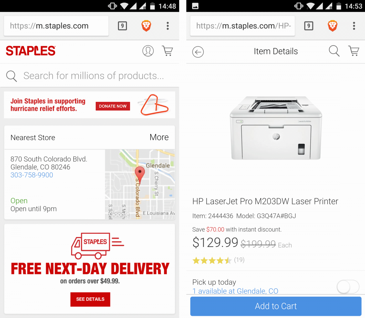
1. Staples.com
Staples, one of the world’s biggest office equipment suppliers, serves its mobile users with a mobile-optimized URL under m.staples.com. The mobile website has fewer elements than its desktop counterpart focusing on what users on smaller screens are looking for.
The search box in the center of the screen is the central element on the page with only two items in the top menu, including user account and cart. The number of featured products is a lot lower compared to the desktop version, making m.staples.com load fast even on slow connectivity. On the search results page, the large red "add-to-cart" button is replaced with an Add to Cart button that is within reach of the user's thumb on mobile devices.
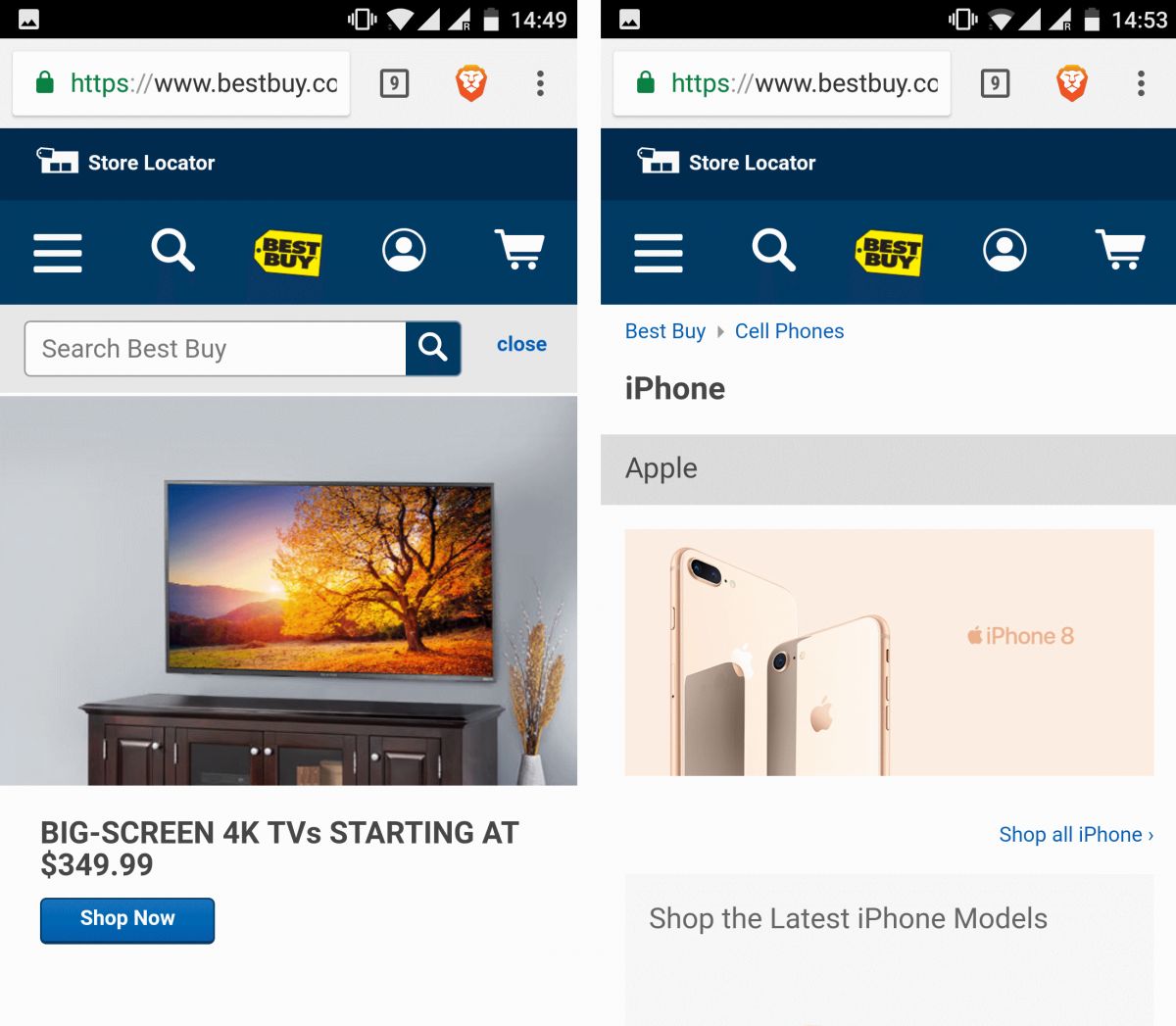
2. Best Buy
Best Buy also chose an adaptive design approach which is used to serve an optimized experience across various devices. The mobile version features a reorganized hamburger menu, search icon, Best Buy’s logo that takes you back to the home page, user account, and the shopping cart.
The menu on desktop features a lot more items, including shopping history, order status, and saved items. There’s also an extra top menu with “Weekly Ad”, Deal of the Day, Credit Cards, Gift Cards. On mobile, these items are accessible from the hamburger menu.
Search results on mobile are a bit different too—the results filter menu and the store availability information are not visible.
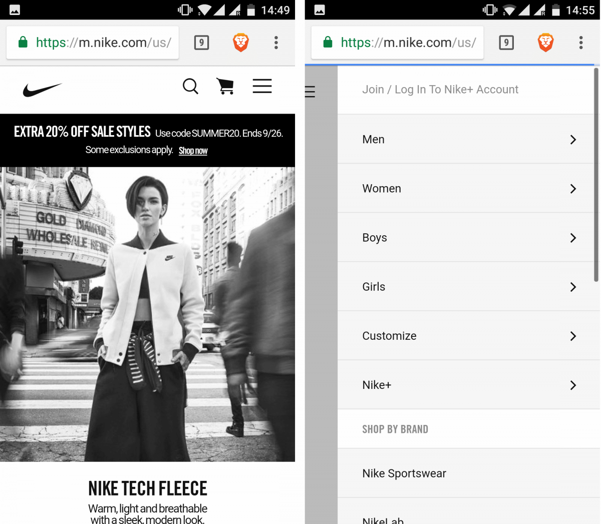
3. Nike
Nike's mobile website is available under m.nike.com. The desktop website uses a looped video on the homepage which on mobile is only a static frame—this is clearly to save on bandwidth and hardware resources.
The menu on top of the mobile page is very limited: it contains search, shopping cart, and the hamburger menu where you can access all necessary options from one place.
When you view an individual item on desktop there's a men/women menu on the left which is not present on mobile. Instead, mobile users can tap the "Refine" link to access search customization options.
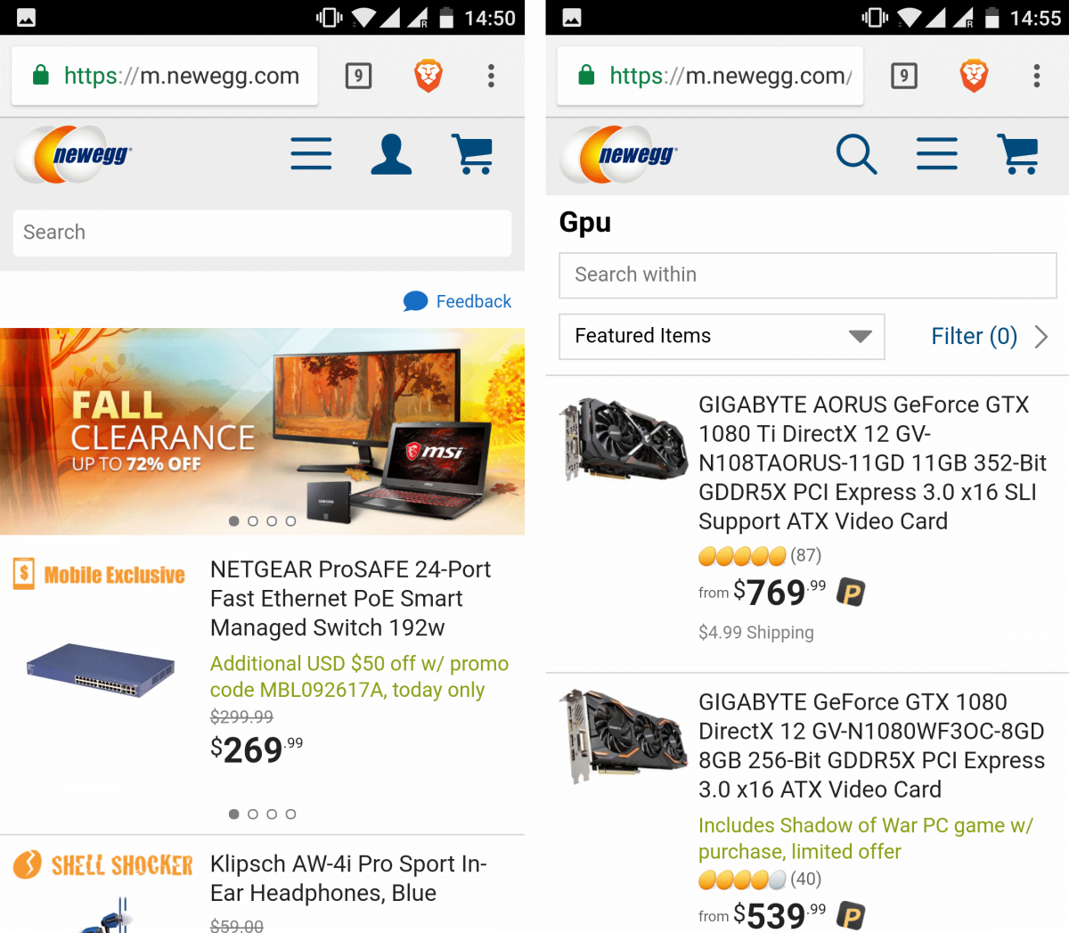
4. Newegg
Newegg, one of the most popular consumer electronics retailers, serves its mobile users with an optimized website available under m.newegg.com. On desktop, Newegg offers massive menus with many options, including deals, featured sellers, product categories, login/register, shopping cart, wish list, customer service, featured website sections (like Gift Cards or VR Central), and a lot more.
For mobile users, this menu is simplified and completely redesigned. It only shows product categories and customer "essentials", such as cart, account, and the wish list. There is only a small banner with promoted items.
When you type "GPU" in the search box on desktop you get a large banner promoting products while on mobile it’s just a list of items. When you view an individual item, a lot of non-essential elements are missing in the mobile version, such as extra options for that product (model, memory size), or "write a review" link. A detailed list of specs is available, but to view it you need to enter a separate page as it’s not loaded automatically like on desktop.
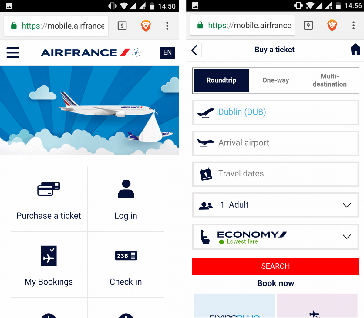
5. Air France
Another company that went adaptive is Air France which redirects its mobile users to mobile.airfrance.com.
The most important options highlighted on mobile are presented in the form of tiles: Purchase a ticket, Log in, My Bookings, Check in, Flight Status, and Information. There are fewer news stories on mobile, while featured travel guides aren't present at all (they're available on a separate page). The bottom menu is also omitted in the mobile version.
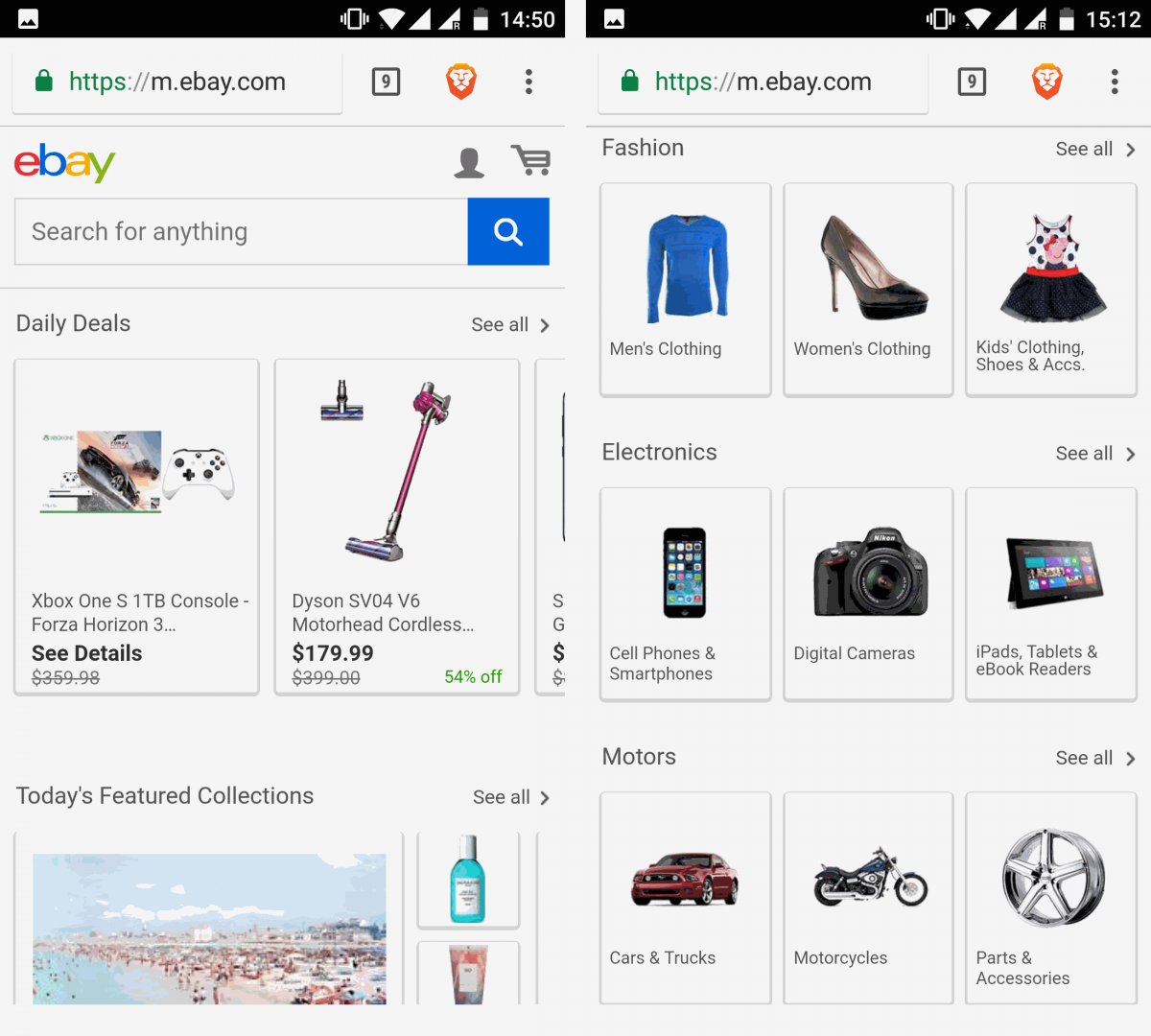
6. eBay
eBay's mobile users are sent to m.ebay.com.
The mobile version is designed around clickable tiles (product photos) promoting selected items. The large hero banners are gone on mobile and so are the large menu with all categories—on mobile they're available under "All categories" at the bottom.
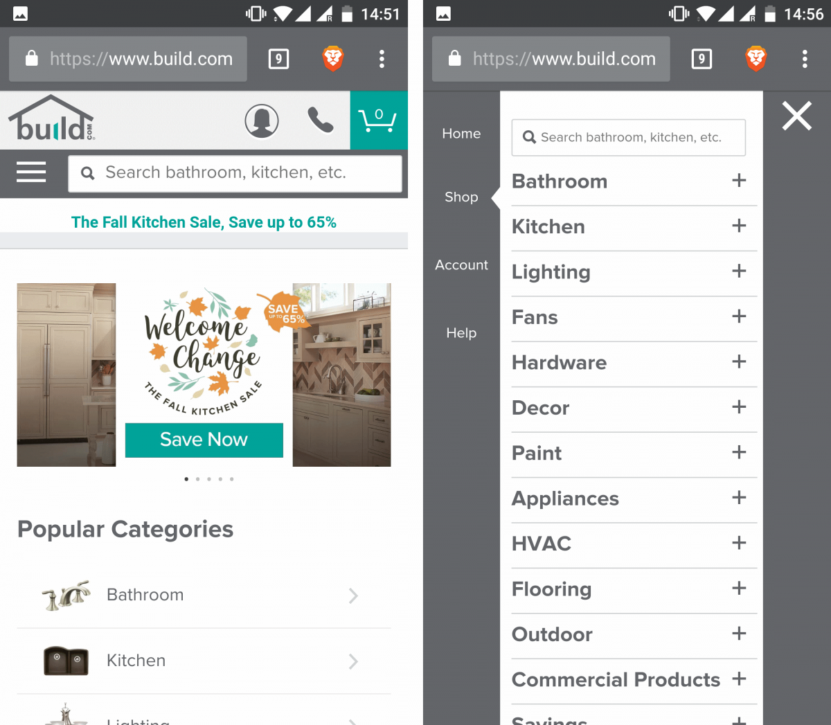
7. Build.com
Home improvement retailer Build.com also chose adaptive web design. The mobile website features a phone icon displayed as a handy tap-to-call link near the top of the page. In the desktop version, Build's chat is available from the top of the page. On mobile, chat is not present at all.
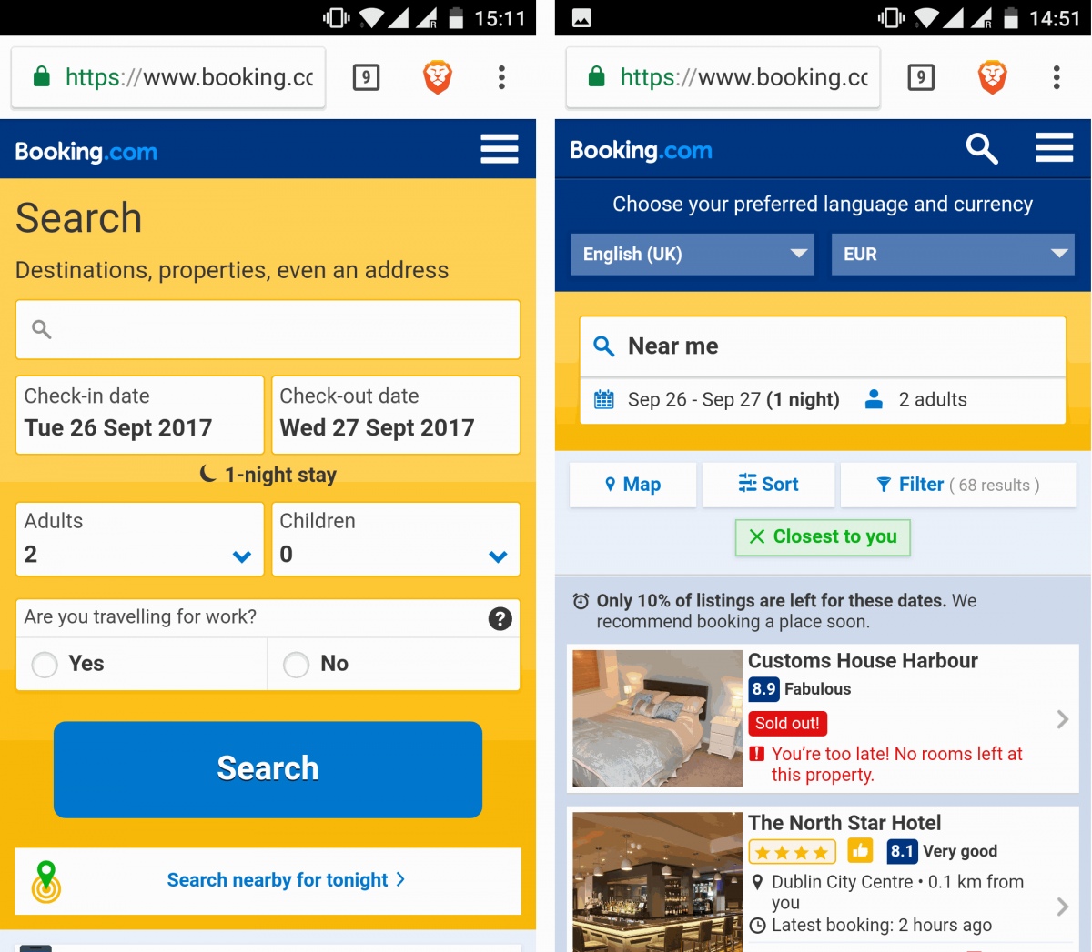
8. Booking.com
One of the world's biggest hotel booking sites uses adaptive design to serve its users with a device-optimized experience. Booking.com on mobile allows its users to "Search nearby for tonight" which recognizes the user's location based on GPS or the current internet provider if GPS location is not available.
Also, Booking.com serves smaller menus, fewer promoted items, and smaller images for mobile users.
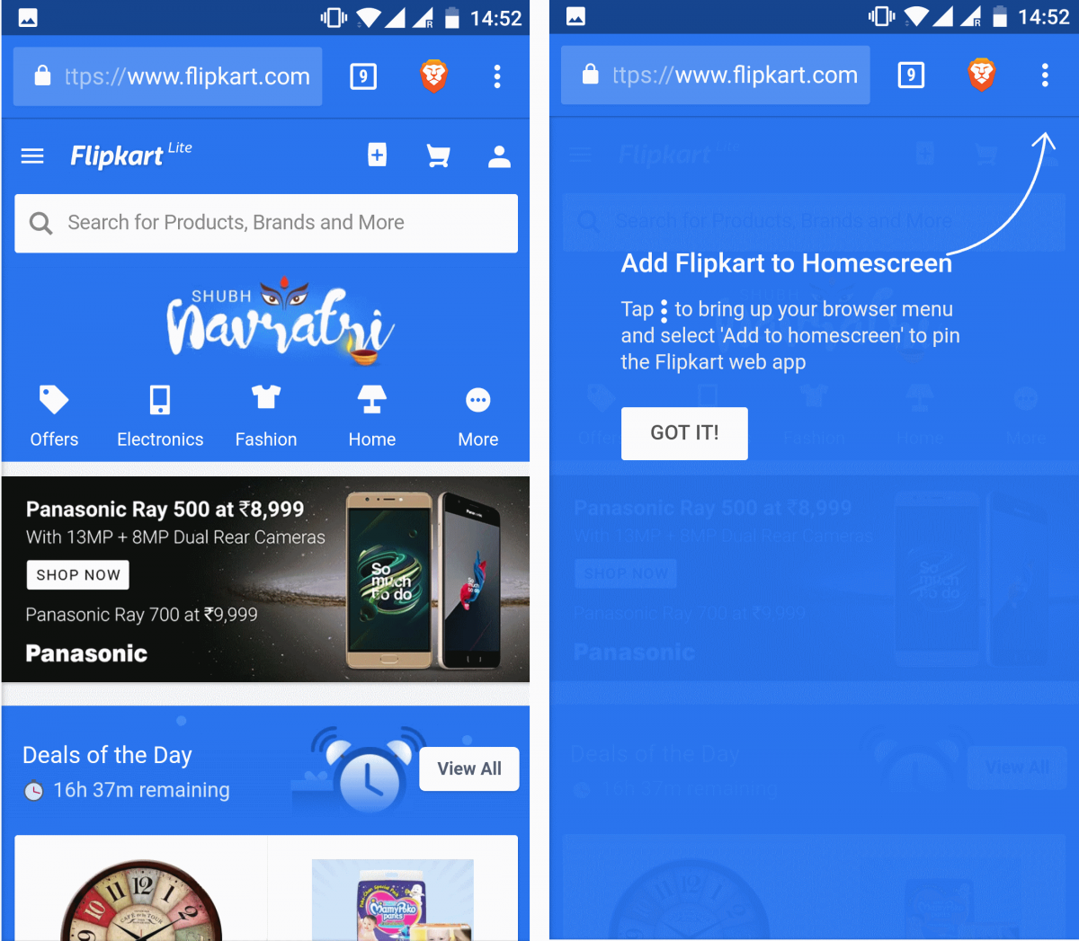
9. Flipkart
India's biggest online store for mobile phones, clothes, and many other items serves its mobile users with a fully functional “Flipkart Lite” experience.
Items for sale are presented in a different way than on its desktop counterpart. Specifically, there is less content, there are no large banners, and the top menu is fully redesigned.
On mobile, the top menu has a handy link to add Flipkart’s website to your home screen, as well as the shopping cart and account icons. Below the menu, there’s a search box and another menu with only four product categories highlighted. On desktop, these two menus are a lot more complex showing many items, not just a few. The "Add to homepage" button is obviously not there.
Looking to optimize your website for mobile?
A similar level of web optimization is possible with DeviceAtlas which offers a super-fast, highly accurate User-Agent parsing solution. This patented algorithm helps you understand what devices are accessing your content so that you can address all differences in real-time.
For example, you can optimize your website based on the viewport size, diagonal screen size, available bandwidth, operating system, or even hardware capabilities. Click the button below to get started with a DeviceAtlas trial licence.
Get started with a local device detection trial
DeviceAtlas is a high-speed device detection solution used by some of the largest companies in the online space to:
- Optimize UX and conversion rate on mobile
- Boost web performance
- Target ads and analyze web traffic
- Enable App analytics and advertising insights
Get started with a locally-installed trial to test DeviceAtlas at no cost.
